The NHL and Adidas have been teasing their Reverse Retro jerseys over the past week. Today, each team FINALLY released those designs. Some of them are great and some leave you scratching your head and saying, “Why’d you bother?” Let’s rank the Top Five and Bottom Five of the bunch.
Top Five Reverse Retro Jerseys
1. Avalanche/Nordiques Crossover
My favorite of the NHL reverse retro jersey designs is the Colorado Avalanche. The jersey pays tribute to their Quebec Nordiques origins with the old “N” and the fleur-de-lis. Adidas added in the current Colorado Avalanche burgundy and blue to go with it.
Our past, our present, remixed for Avs Faithful.
— Colorado Avalanche (@Avalanche) November 16, 2020
Introducing the Colorado Avalanche adidas #ReverseRetro jersey. Hitting the ice in 2021.#GoAvsGo pic.twitter.com/zNgLmLDowQ
It’s my favorite of the bunch and one NHL pundit agrees.
THEEEE @Avalanche Quebec Nordiques new ones- OMG !!
— Kevin Weekes (@KevinWeekes) November 16, 2020
????. Reverse retro !!!@NHL @NHLNetwork pic.twitter.com/rfcNu4LRhE
2. Lady Liberty Reemerges
My next favorite of the NHL Reverse Retro designs is the New York Rangers. As a New Jersey Devils fan, I have learned to hate our rivals across the Hudson River. But full disclosure: I can’t hate them for bringing back the Lady Liberty jersey. The Lady Liberty design was the Rangers’ original alternate from 1996-2007 before making the Heritage Jersey in 2010.
Finally. Liberty returns. ?
— New York Rangers (@NYRangers) November 16, 2020
Introducing the #NYR adidas #ReverseRetro jersey, hitting the ice in 2021. pic.twitter.com/Co3N9B8QeT
3. Carolina Breaks out the Brass Bonanza (Again)
Another tribute jersey was done by the Carolina Hurricanes. This time, the Canes pay tribute again to the Hartford Whalers. Last season, the Canes had a Whalers Night in which they wore the original Whale design, paid tribute to past Whalers, and had an alumni game. Good on the Hurricanes for going back to their roots.
Cue up Brass Bonanza. Introducing the #Canes adidas #ReverseRetro jersey. Hitting the ice in 2021 pic.twitter.com/IjoVzdsqn2
— Carolina Hurricanes (@Canes) November 16, 2020
4. Winnipeg’s Classic Jets with a Modern Twist
One more former WHA team pays tribute with an old design with a modern twist. The Winnipeg Jets’ Reverse Retro jersey features the old Jets’ logo with their current polar night and aviator blues and silver. It’s a really clean looking jersey.
The #ReverseRetro jersey combines the classic style with the team’s current colourway.
— Winnipeg Jets (@NHLJets) November 16, 2020
Available December 1st, you can preorder the adidas Reverse Retro jersey NOW on True North Shop! pic.twitter.com/bUKJ1Fkcjs
A part of me wishes they had paid some tribute to their former Atlanta Thrasher days, but it looks like that’s been done:
#ReverseRetro @adidashockey pic.twitter.com/XES3eEC8KS
— Atlanta Thrashers (@NotThrashers) November 10, 2020
5. L.A. Kings Gold Rush
If you’re an old school Los Angeles Kings fan, you remember the gold and purple (aka “Forum” blue) days. Those days had heaping handfuls of Rogie Vachon and the Triple Crown Line. After Wayne Gretzky came to town, they switched to the silver and black. Now, the gold and purple (er, “Forum” blue) are back on this jersey!
Forum Blue and Gold reigns again. Introducing the LA Kings adidas #ReverseRetro jersey.
— LA Kings (@LAKings) November 16, 2020
Hitting the ice in 2021. pic.twitter.com/uamn5faXQC
If I’m honest, though, I wish Adidas would have brought back the same colors, but with the Burger King jersey.
/cdn.vox-cdn.com/uploads/chorus_image/image/65901478/53125207.jpg.0.jpg)
Bottom Five Reverse Retro Jerseys
Now we go to the five losers of the Reverse Retro release. Some of these teams were either lazy or Adidas didn’t even bother changing some of their schemes. Here are the five losers and my recommendation for their Reverse Retro jerseys.
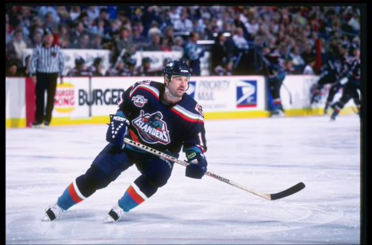
1. New York Islanders
Not much effort went into this jersey. In fact, it looks a lot like the jersey they’ve been wearing the last ten seasons. Considering who their general manager is, I’m not shocked that there weren’t a lot of changes.
Built on a Dynasty.
— New York Islanders (@NYIslanders) November 16, 2020
Introducing the #Isles adidas #ReverseRetro jersey. Hitting the ice in 2021. pic.twitter.com/ZhDGxbagwu
Recommended Jersey: “The Gorton’s Fisherman,” which actually looks like the legendary Stan Fischler. It was panned for so long, but it’s so legendarily bad, it BEGS for a reverse retro with the current colors.
2. Montreal Canadiens
Again, not much effort. The Canadiens’ have worn the bleu, blanc, et rouge for the majority of their history and their primary and secondary jerseys have always been white or red. Adidas introduced the “bleu” version in their collection and it’s… blasé (as the Quebecois might say).
The Canadiens’ adidas #ReverseRetro jersey is inspired by the color that marked the team’s first sweater in 1909.
— Canadiens Montréal (@CanadiensMTL) November 16, 2020
The design is a take on the one worn from 1974 to 2007 – a period during which the club won six Stanley Cups.
? https://t.co/8S9a50Hzvv#GoHabsGo pic.twitter.com/8gW0mQcnt1
Recommended Jersey: If Adidas really wanted to go with a “bleu” jersey, I’d recommend this one from their 100th-anniversary collection.
3. Florida Panthers
Adidas brought back the pouncing cat that adorned the jersey from their inaugural season in 1993. The Panthers introduced a blue alternate in the 1997-98 season and made it primary from 2007-2011. The retro jersey brought back is basically THAT SAME one.
Your Colors. Your Retros. Remixed. The #FlaPanthers adidas #ReverseRetro jersey available 12/1. pic.twitter.com/vt8G6AZia2
— Florida Panthers (@FlaPanthers) November 16, 2020
Recommended Jersey: The Panthers had a really nice blue alternate jersey they used from 2009-2012 with the panther head in a crest, but make it gold and red.

4. Boston Bruins
The Bruins have had some nifty jerseys in their nearly century-long existence. Their original colors were gold and brown until 1934 when they switched over to their iconic gold and black with variations of their jerseys since. This reverse retro edition is just kinda… meh.
A nod to ’90.
— Boston Bruins (@NHLBruins) November 16, 2020
More #ReverseRetro photos ➡️ https://t.co/7CMxTulPzE pic.twitter.com/A6muv8gyYw
Recommended Jersey: The B’s had a special jersey made during the 1991-92 season for the NHL’s 75th anniversary. (Be thankful I didn’t recommend the “Honey Bear” design adorned between 1995-2006.)

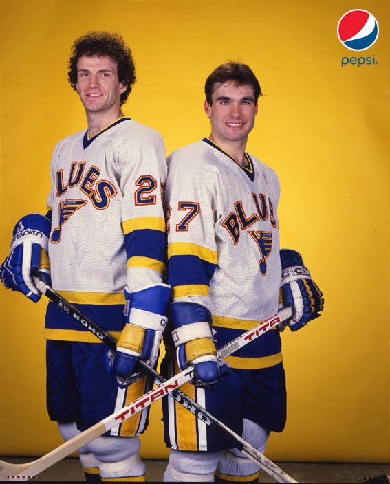
5. St. Louis Blues
Another iconic design gets a redo. But which design did Adidas redo? The classic inaugural jersey from the 1967-68 season? Nope: they went with the brass section from the 1996-97 secondary jersey that is a reminder of the ever-unpopular Mike Keenan Era in St. Louis. Worse off: they made it RED.
Crafted for the home of the Blues. Introducing the adidas #ReverseRetro jersey. Hitting the ice in 2021. pic.twitter.com/QP98PxpucH
— St. Louis Blues (@StLouisBlues) November 16, 2020
Recommended Jersey: The 1984-85 jersey with “Blues” across the chest, but make it a “Back in Black” edition.
Which NHL team do you think had the best Reverse Retro jerseys? Leave a comment below or hit me up on Twitter: @WhoIsRyanMcC. And don’t forget to check out my podcast No Credentials Required (new episodes every Wednesday) and my live stream show A-Round for the Weekend (most Fridays at 6:30pm).