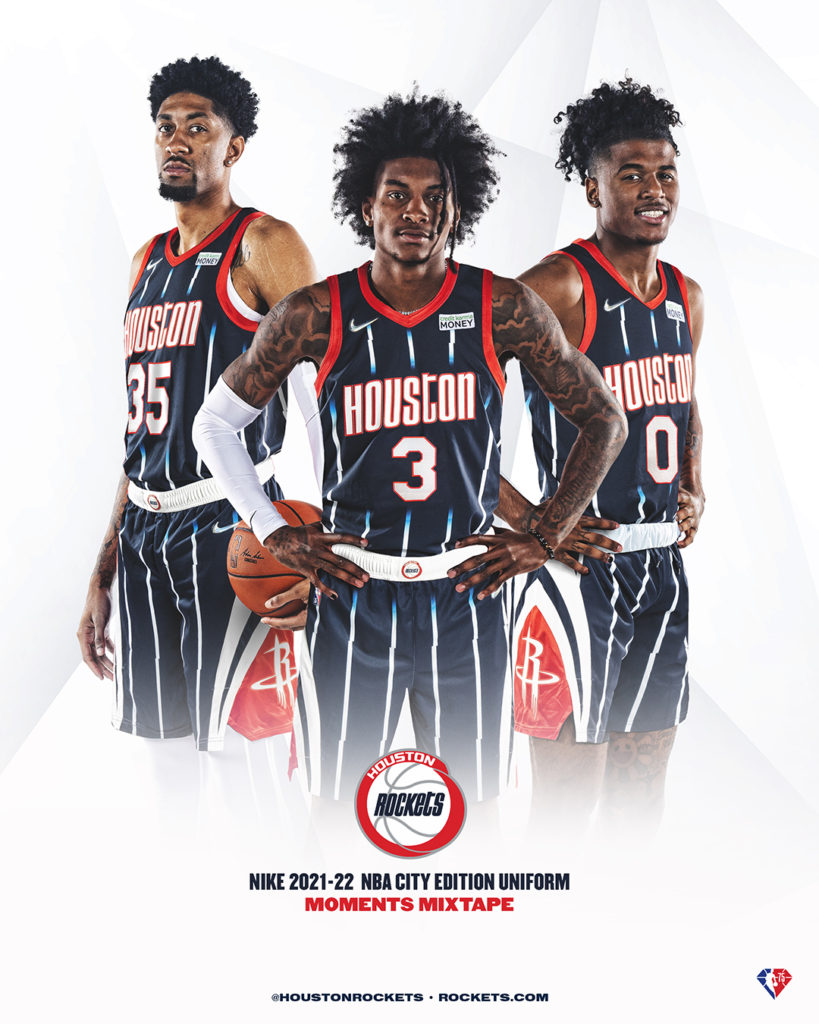
Yes! We have a special midweek Rockets’ Round-Up because the Houston Rockets have a brand new uniform for the 2021-22 season. Much like the light blue “H-Town” jerseys a year ago, or the NASA-themed white uniforms before that, Houston got a new set of one-year-only uniforms.
This year’s special uniforms look familiar… intentionally. No, they’re not throwbacks. They’re what the NBA is calling “moment mixtapes.” In honor of the 75th anniversary of the NBA, each uniform across the league ties to the history of that franchise.
Houston had roughly the same uniform from their move to Houston in 1971 until the 1995-96 season. After winning two titles in the ketchup and mustard “Clutch City” classics, the Rockets went to navy and pinstripes. Win a few titles and see yourself as the 1950s Yankees, I suppose.
The Rockets went back to red for the 2003-04 season. In their first season in the Toyota Center, Houston’s nostalgic colors matched a new “rocketing R” logo. Recently, while keeping the colors and the logo, Houston has opted to go with black trim and big lettering.
What’s Sticking Out

Truthfully, the Moment Mixtape uniform stands out when compared to the other Rockets’ jerseys because it’s based on the shortest-lived color scheme. Houston only wore navy and white stripes for eight years, but the franchise opted to build the uniform off of that. The 90’s nostalgia and throwback uniforms are trendy, and the Rockets uniform looks as 90’s as any.
So yes, #RedNation has a blue uniform. Again.
But much like the last one was “Oiler Blue,” this year’s blue uniform is intentionally playing off of a peer iso of transition. In the waning years of Hakeem Olajuwon, the Rockets needed a reset. They navigated that reset, and drafted Yao Ming while wearing these navy and white stripes. Now, admirer the exodus of another great Rocket last season, Houston is starting over again. Yao’s rookie season was in stripes, and now (part of) Jalen Green’s will as well.
What Hits
A jersey that represents #Rockets history. ?
— Houston Rockets (@HoustonRockets) November 1, 2021
How we feeling H-Town? ? pic.twitter.com/r7uqtQQz8Z
The blend of logos meshes extremely well for this Houston Rockets uniform. The ‘kets utilize the “Houston” lettering from the vintage championship uniforms and the shorts logos are from a handful of 21st-century stars. The “extra gear” all features the navy and white “R” as well as a navy and silver blocking of the ketchup and mustard logo.
Truthfully, as the pinstripe shorts had their own red stripe, the 21st-century Rockets shorts logo plays well too. It feels like the modern twist on an iconic throwback… which is the point.
The only part that doesn’t hit is the amount of empty space in the middle. 90s babies (and older) will recall the large logo at the middle of the original pinstripe jerseys. In a large logo that was reminiscent of a graphic tee, the majority of the jersey’s front was really a red, blue, and silver logo. Now?
Now that space is taken with a more traditional “Houston,” and a number. All around the number is the same blank space that was there behind the logo in the ’90s. Single-digit numbers (like Jae’Sean Tate’s 8, Kevin Porter Jr.’s 3, or Jalen Green’s 0) leave a lot of blank space at the focal point of the uniform.
Regardless of uniform, the rebuilding ‘Kets need something to build on. If Hall of Famer Yao Ming started his career in pinstripes, maybe the designers were into something.
For more on sports, sneakers, and fandom, follow me @painsworth512 for more. Give our podcast “F” In Sports a listen wherever you listen to podcasts! Be sure to check our NEW weekly basketball show, The Midweek Midrange, on YouTube,Twitter, and Instagram!


