ESPN’s The Last Dance docuseries helped me reminisce on the Chicago Bulls’ runs in the ‘90’s. I also remembered some of the uniforms in the NBA during the 1990’s. Some of them were pretty tight; expansion teams like Charlotte, Orlando, Miami, and Minnesota were so fresh and so clean (clean). However, there were some uniforms that were downright awful, reprehensible, and screeched, “THIS IS THE 90’S!!!” I’ve taken stock and ranked the five worst NBA uniforms of the ’90s.
5. Utah Jazz (1996-2010)
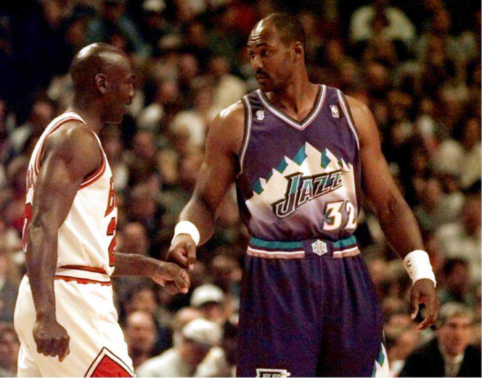
The state of Utah is known for four things: bees, Mormons, mountains, and the Jazz. In the mid-1990s, the organization revealed an updated version from the original music note logo which they’ve used since their days in New Orleans. The original colors of white, purple, and green were shelved for lighter purple, white and teal. The music note was replaced with a faded “rush” logo.
Granted that there may or may not be any jazz clubs in the state of Utah and the music note and letter styling had been a bit passé. But the color combination clashed and the number style was weird. When I watched The Last Dance, I was reminded of how bad this uniform was. The logo and numbers were modified in 2004 and thankfully, the organization reverted back to the “note” logo in 2010.
4. New Jersey Nets (1990-91)
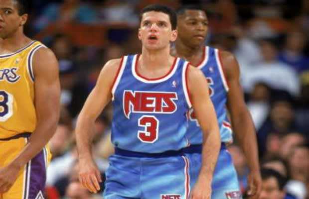
The Nets were one of the worst teams in the NBA in the late 1980s and totaled 36 wins in the final two seasons of the decade. They also had one of the more outdated looks since becoming an NBA franchise in 1977. The organization made the bold decision to modernize their logo and uniforms in 1990. The new logo featured a three-toned color scheme. Their road uniforms, though, was one of the weirdest designs in the NBA.
The Nets went with a light blue faded to white and back to light blue. It looked like a bad pair of jeans. The uniforms were so bad that in some weird ways, they actually looked good. The change didn’t do much good, though; the Nets finished 26-56 in 1990-91. The next season, they switched from the two-tone blue road uniform to a solid blue and made the playoffs.
3. Cleveland Cavaliers (1994-99)

After a series of some of the worst uniforms in NBA history, the Cavaliers revealed one of the cooler uniforms and logos in 1983. They switched from “wine” and gold to blue, orange, and white. I believe these colors were the primary reason for their success as they made the playoffs in seven of the next 11 seasons. Then came 1994 and the organization moved into the new Gund Arena (now the Rocket Mortgage Fieldhouse).
With the move came a new logo and new uniforms that looked avant-garde. (That’s French for “unpleasant.”) The Cavs added black to their color scheme, lightened the color blue, and added a wave to their jersey. They made the playoffs only three times over the next ten seasons in that uniform. Coincidence? I think not. The truly strange scheme was scrapped after the 2002-2003 season.
2. Atlanta Hawks (1995-99)

The Hawks uniforms, colors, and logo were one of the coolest in the NBA in the 1980s and early 1990s. In 1993, the jerseys, in particular, got a little weirder after removing the red sash. But in 1995, the layout of the jersey changed dramatically and not for the better. The Hawks literally spread their wings and placed their logo on the front of the jersey.
The front number shrunk and shifted to the top left side of the chest. The primary color of the road uniform became faded two-tone from black to red and back to black. I’m certain that this uniform was the precursor to Angry Bird’s Red. The Hawks made five consecutive playoff appearances in the uniform but never got out of the first round. The uniform was redesigned in 1999.
1. Houston Rockets (1995-2002)
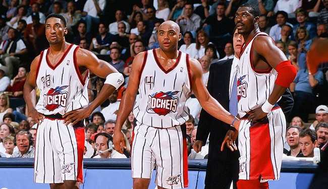
And now we crown the worst NBA uniform of the 1990s. After winning their second consecutive championship in 1995, the Rockets modernized their logo and uniform. What we got was so egregious, the designers should have been brought up on crimes against humanity. The Rockets bravely, but poorly attempted to jump on the pinstripe revolution. The front of the jersey prominently featured a newer, ghastlier logo and a number on the right chest.
It featured an even worse alternate logo patch on the left pant leg. Thankfully, a cleaner, simpler look replaced this monstrosity after the Rockets and drafted Yao Ming in 2002. (Ever notice a lot of these uniform redesigns are done when a top-flight player joins the team?) But this uniform was probably the worst of them all in the 1990s and basketball fans are better off without it.
Do you agree or disagree? Did I miss anyone? Leave a comment below or hit me up on Twitter, @WhoIsRyanMcC. Want more basketball coverage? Be sure to check out the Hardcourt Hunnies podcast with new episodes dropping every Tuesday!


