The NBA City Edition gear has been released for the 2020-21 season. For me, most of it is complete garbage. But for your entertainment, I’m going to review each team’s new City Edition hats. Time for me to get my Simon Cowell on and eviscerate these hats. The grades are in, and the F’s are flying.

Lakers: F-
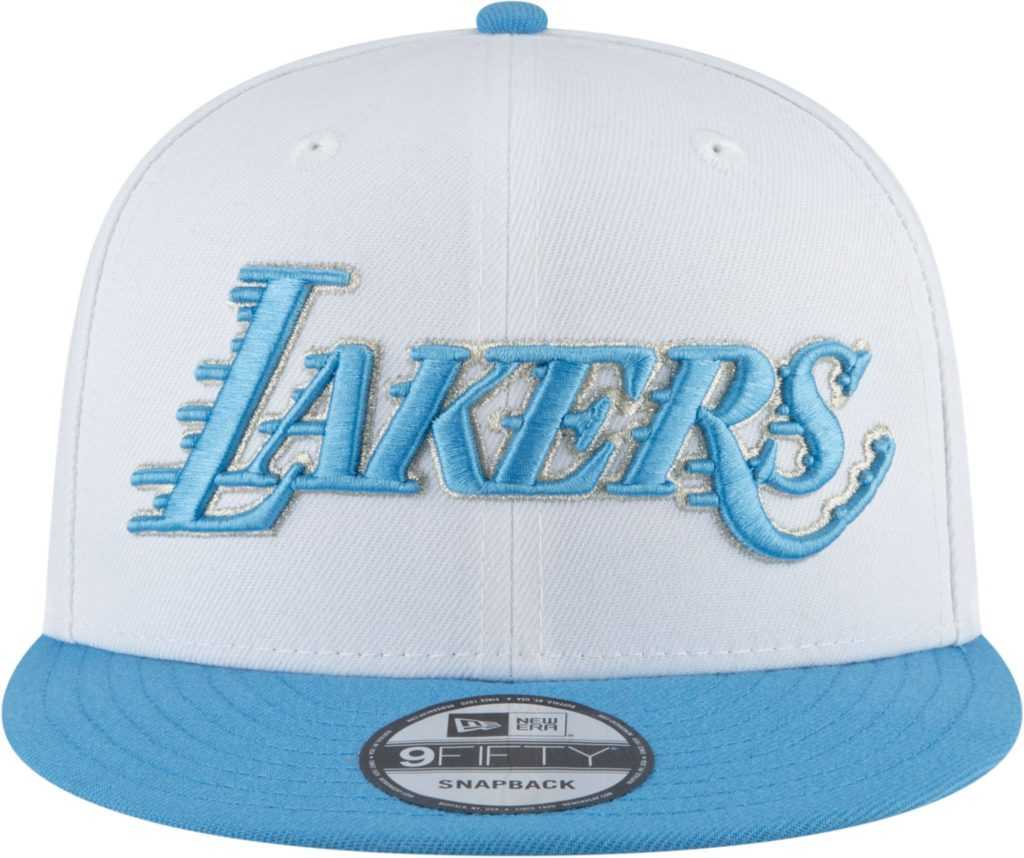
There are two NBA teams that should never put out other colors on their gear other than the primary colors. The Los Angeles Lakers are one of those teams. If it’s not purple and gold, then it is a complete waste of time. This hat makes me sick, and Laker nation should avoid it at all costs.
Heat: A-
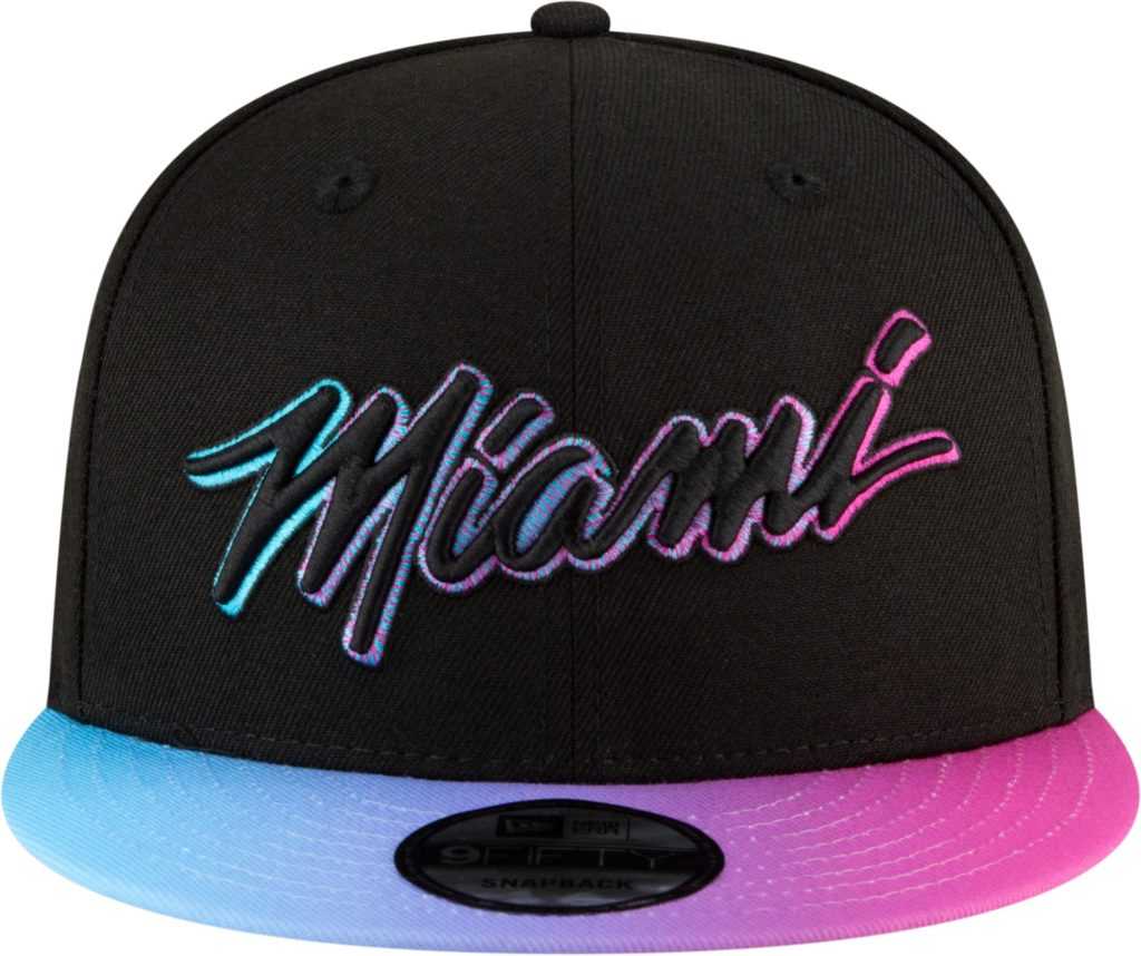
Can Miami make this their primary colors already? This City Edition hat screams Miami, and I love it. Miami is coming off a very successful season and the best way to get better is to wear this gear on a daily basis. I’m not giving out too many A’s in my grading but this hat is definitely in the superior category.
Bucks: B-
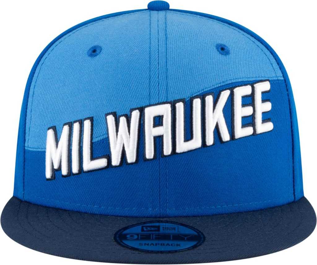
Milwaukee has been on my hate list since changing their purple and green combo from the early 2000’s. Now the Bucks seem to be in an identity crisis rocking the all blue hats in the new City Edition gear. I hold grudges, Milwaukee. Bring back the purple!
Nets: D+
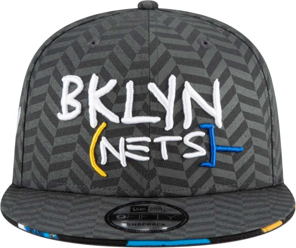
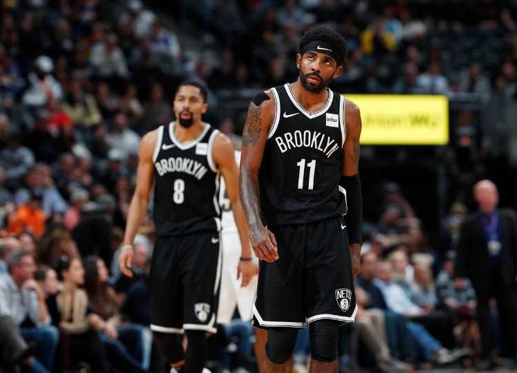
Brooklyn is easily going to be the most annoying team to follow this season. Especially when Kyrie Irving becomes a modern-day Jackie Moon and begins to run the franchise. The most annoying team needs annoying gear to have. The City Edition hats are a match made in heaven for this team. THE EARTH IS NOT FLAT, KYRIE!
Hornets: A-
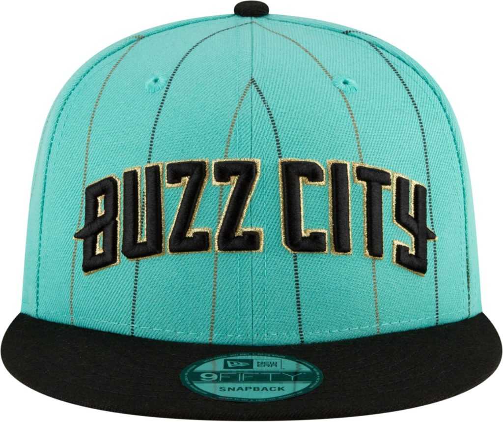
Maybe I’m a little bias here, but the Hornets City Edition hat looks solid. The biggest key for any type of Hornets gear is that the teal is incorporated in some way. Buzz City should definitely be proud of these. Also, I may already have one.
Nuggets: C-
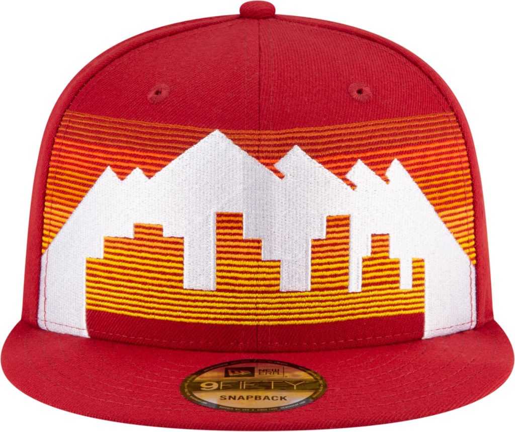
Denver has had beautiful jerseys only one time in my life. That would be during the Carmelo era. What they’re doing now just has me irate with the franchise. Sometimes I’m not sure which franchise is trying to create the worst gear, but Denver is in the running.
Mavericks: D
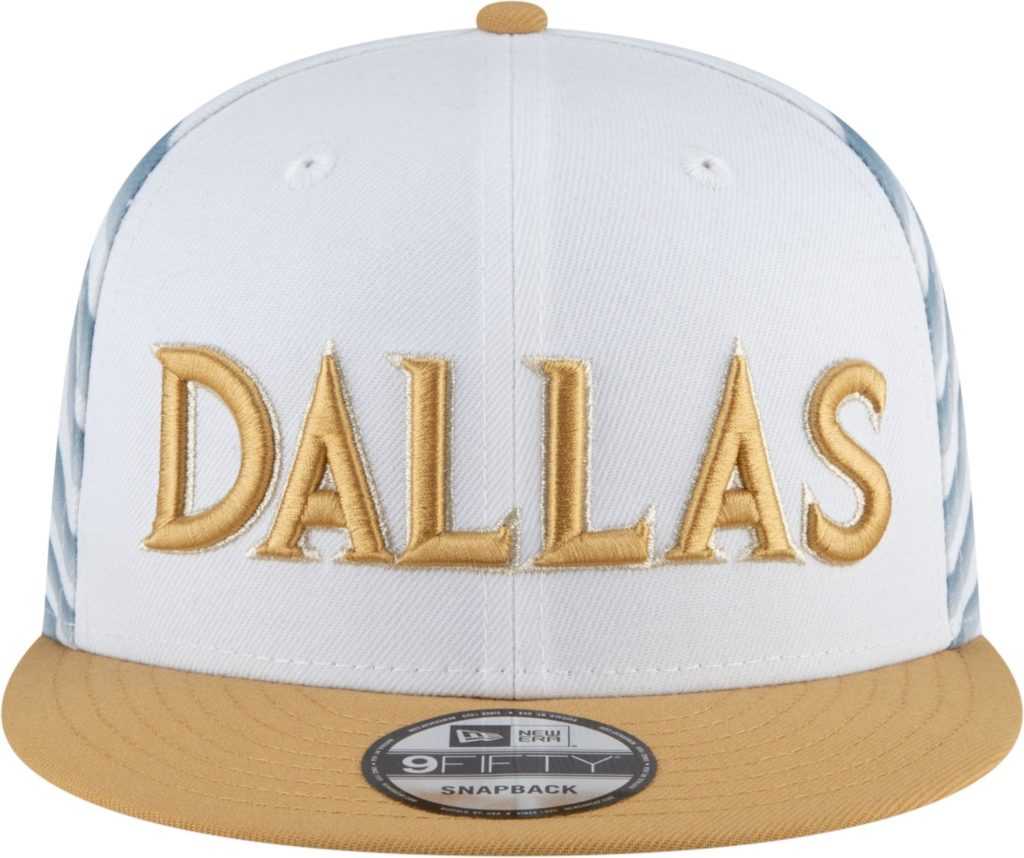
The Mavericks had some of the best City Edition gear last season, and I expected it again this year. However, Dallas failed to reach me this season with the gold and white. Dallas needs to move on from this abomination and return to last season’s City gear.
Bulls: A-
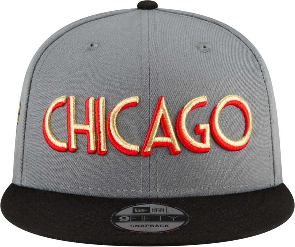
Chicago‘s gear has become iconic to many due to one of the GOAT’S rocking the red and black in the ’90s. I actually like this hat, but would have preferred more red. Bulls fans haven’t had much to cheer about lately. They can be proud of this City Edition hat though.
Knicks: B
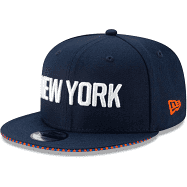
The Knicks may be awful on the court, but they will look good doing it. The Knicks have one of my favorite color combos of all time with the blue and orange. This City Edition hat is a keeper.
Clippers: F+
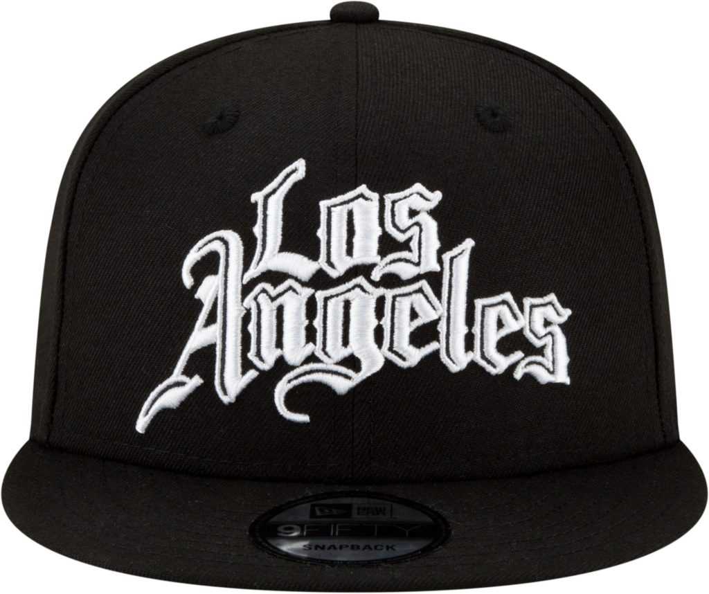
The Clippers have easily made my bottom three in style and design in this year’s City Edition hats. This hat looks like it is sold at your local dollar store. I know last year ended on a sour note, but at least give the fans something to be proud to own.
Jazz: D+
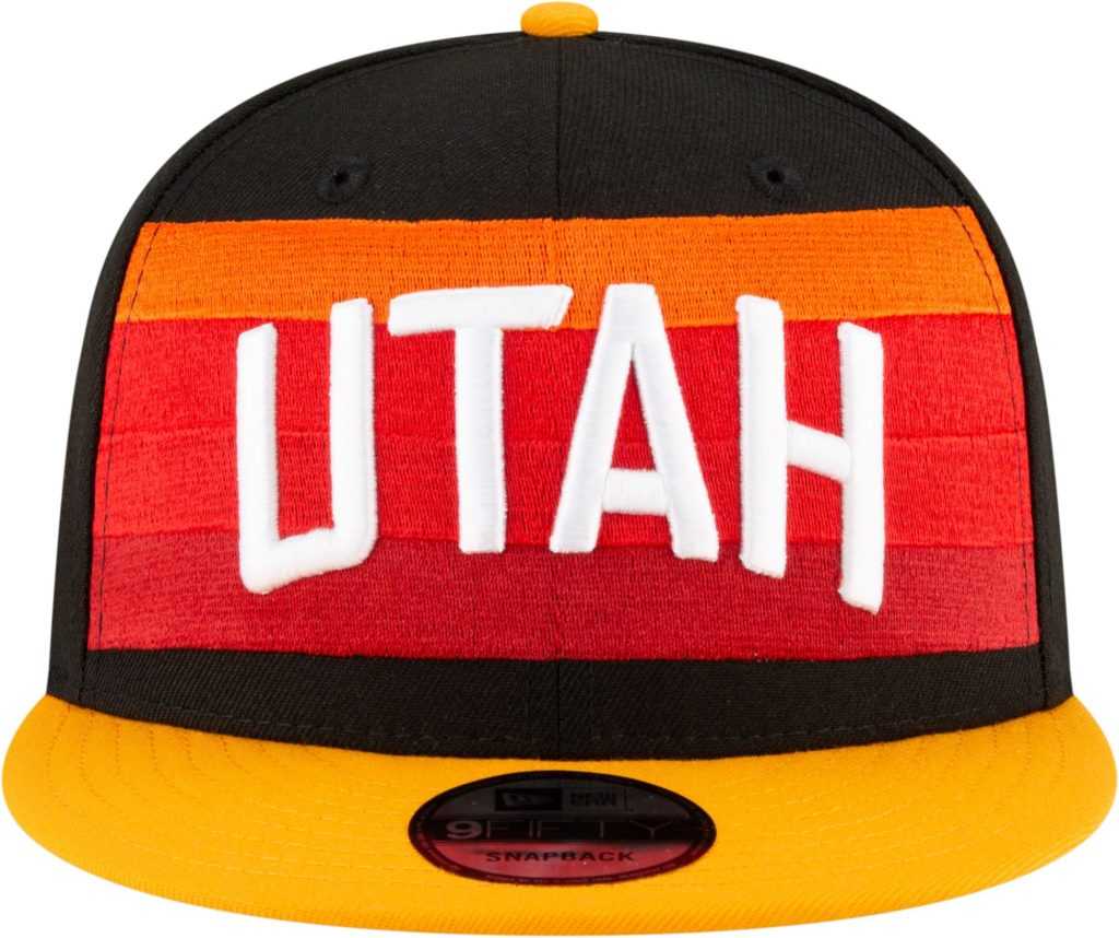
I’m not sure why the Jazz and Nuggets want to look the same but apparently that’s the goal here. Utah not rocking the 90’s gear that Stockton and Malone made famous is incredibly sad. Going to be really bummed watching the Denver-Utah NuggJazz play in their heinous City Edition gear this season.
Thunder: A
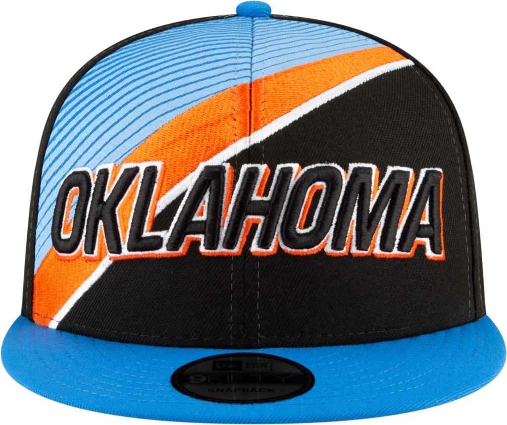
The more I look at this hat, the more I love it. Once again, the orange and blue color combo is money. Throw in the black and you have near perfection.
Blazers: B+
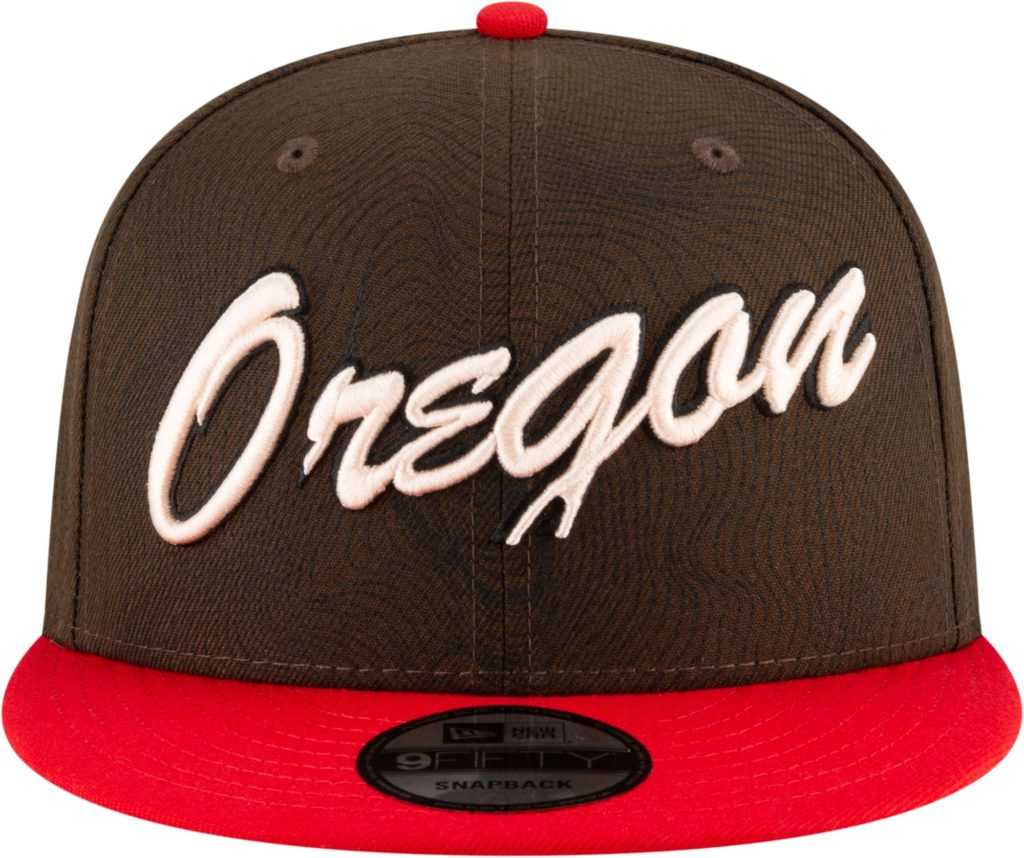
I really like this attempt for Portland. I’ve never been to Oregon, but I just feel like this hat is the vibe Oregon gives. It’s plain and simple. The message is clear. This is Oregon’s team.
Hawks: D-
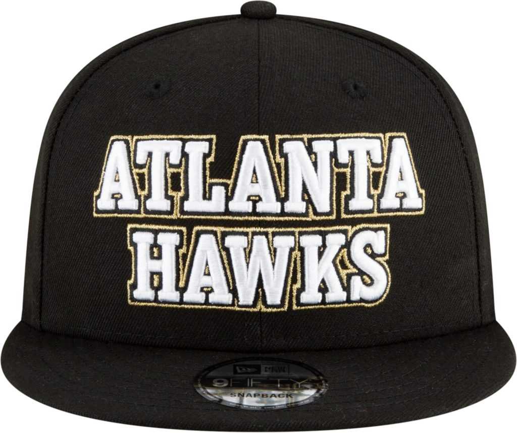
I’m so glad Atlanta made a jersey switch this season. The highlighter green or whatever that was on the past jerseys were straight vomit. While I like the new jersey change, I hate this hat. It’s boring and needs more than what you see. For a franchise that has an exciting player like Trae Young leading the charge, I expected more.
Cavs: C+
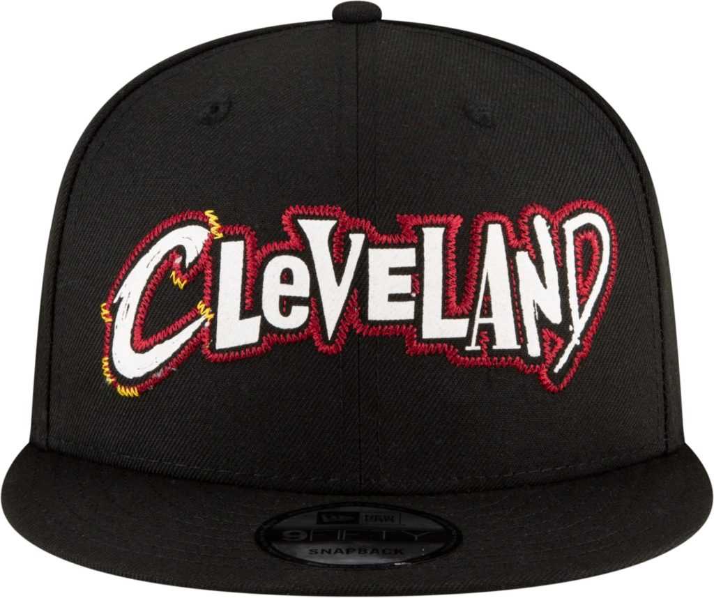
The City Edition jersey gives me strong Monstar vibes for some reason I can’t explain. Cleveland has had an identity crisis since LeBron left them for better times for the second time. Maybe Cleveland should just start all over. This one isn’t much of a winner.
Pelicans: B
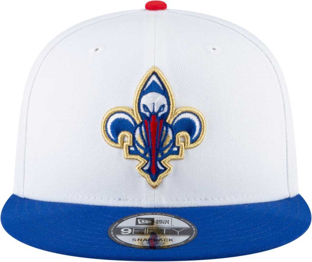
I want to hate this hat but I can’t. I hate the Pelicans mascot and everything about New Orleans basketball. They were the home of the Hornets for too long and I’ll always hold a grudge against the city. Although this hat is pretty nice.
Wizards: B+
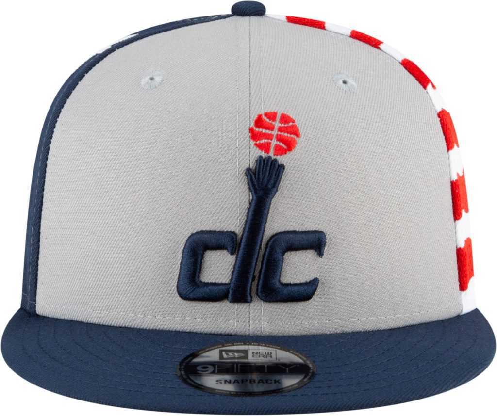
The Wizards didn’t do anything flashy, and I like that. The City Edition cap is original and the team has a great color combo that doesn’t need to change. This hat was very close to being an A, but my grades are final.
Celtics: A+

Lakers, take notes. This is how a prestigious franchise creates new gear. Boston will always be synonymous with the green and white, and this city edition hat does not disappoint. Not sure if this is my favorite hat, but this is definitely cracking my top 3.
Pistons: A
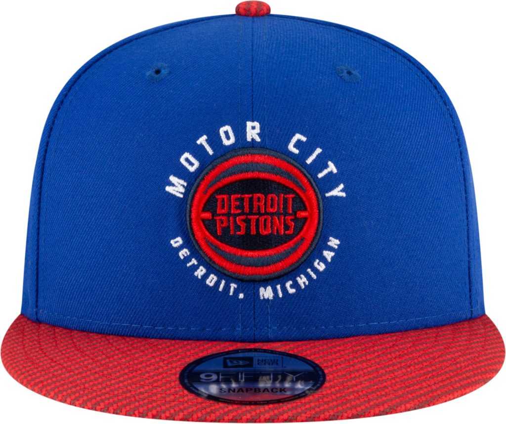
The city of Detroit needs a win. Professional sports have been absolutely dreadful in the city of Detroit recently, but at least the Pistons will look good while taking L’s.
Raptors: C+
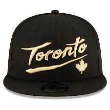
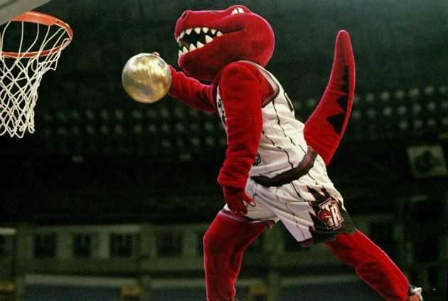
Toronto has the best color scheme and mascot combat in the league. Going away from the purple was hard for me to accept, but now seeing bland gold and black is weak. Give me dinosaurs in shoes playing basketball or give me nothing at all.
Magic: F+
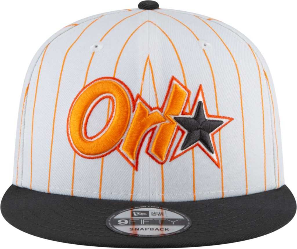
I. Hate. This. Hat. Sticking with the classic design is fine, but this color combo has made my brain explode. This has landed in my bottom three of the NBA City Edition hats. I don’t even want to talk about this hat anymore.
Timberwolves: B+
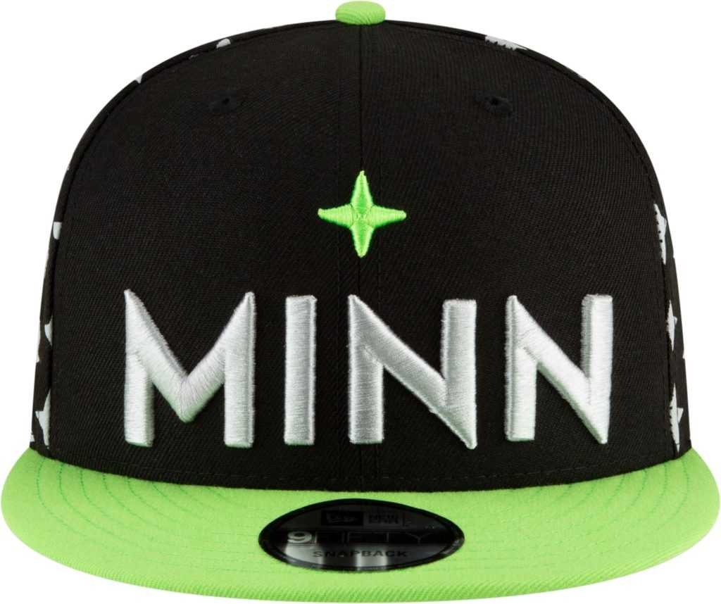
Big fan of the color combo here. This hat takes me back to my childhood of going around, giving the D-Generation X chop every chance I could. I prefer Minnesota to rock a little blue, but this hat doesn’t miss by much.
76ers: D
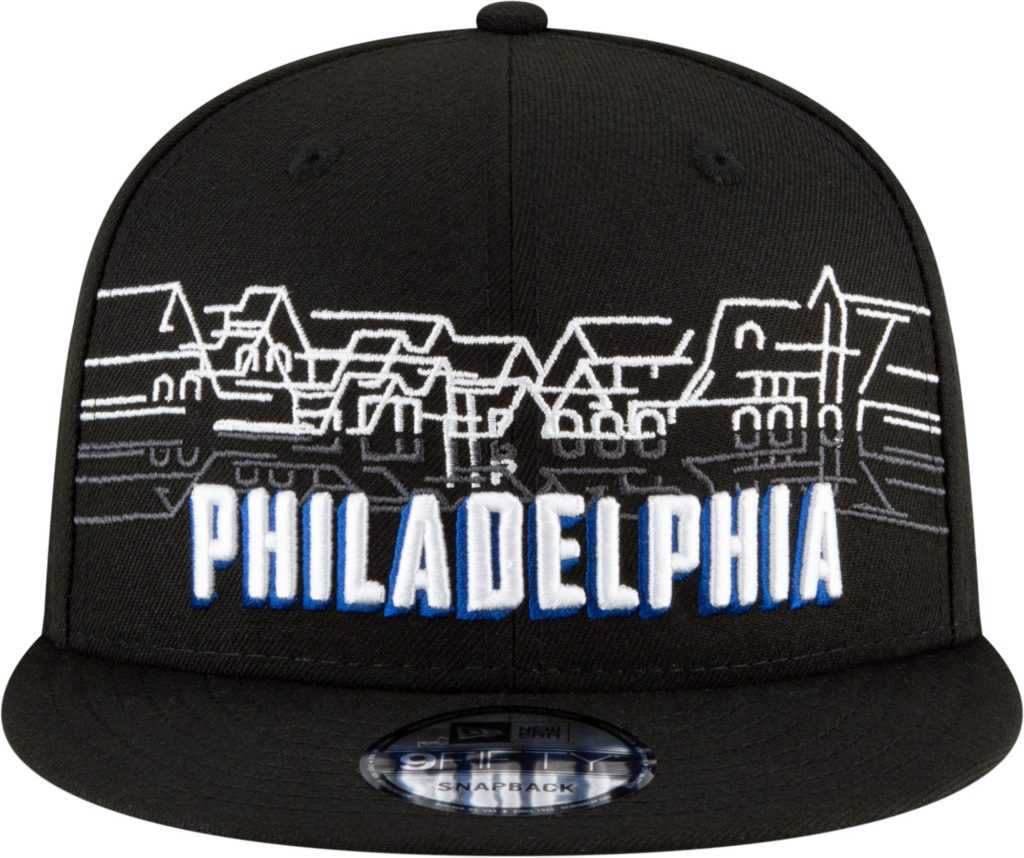
Philadelphia, this hat sucks. I understand the idea of showing city pride, but this hat isn’t doing it for me. The 76ers not only lose to Boston on the court, but they also lose to them in the hat game. Step up, Philly.
Grizzlies: B
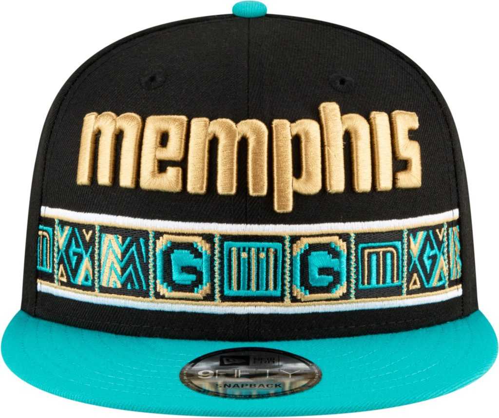
Memphis has a strong showing with their City Edition hat this year. This hat makes me reminisce on a time Canada had another NBA team before being shipped to Memphis. I still try to wrap my head around Memphis having an NBA team, but they are bringing the heat when it comes to gear for the fans. One thing I ask from Memphis is to bring back the intimidating grizzly mascot and not the soft teddy bear you have now. Just do it!
Pacers: A
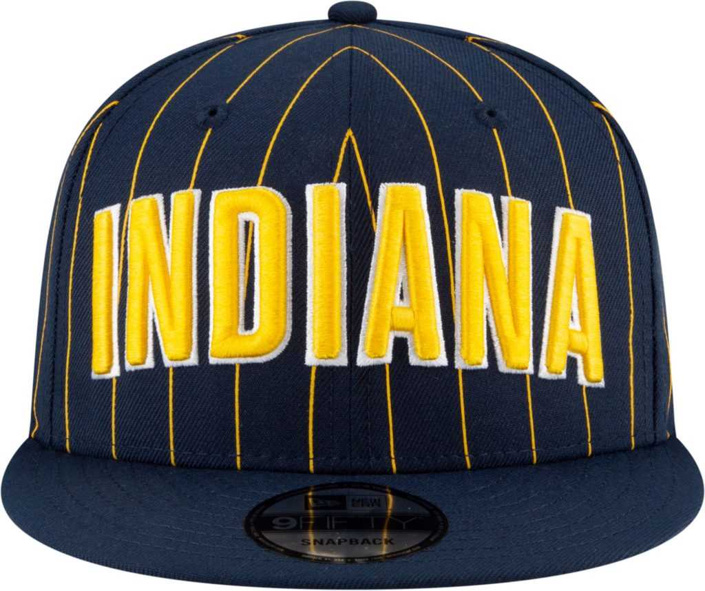
Kudos to Indiana for being their normal boring self. This City Edition hat is great, but it also symbolizes the boring franchise that is the Pacers. Can we all agree that nobody pays any attention to the Pacers? You see them randomly in the playoffs and always think, “Good for them.” Thank you, Pacers, for never changing.
Spurs: A+
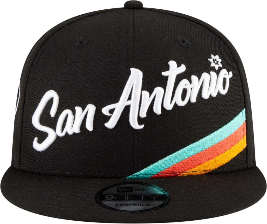
The winner of the NBA City Edition gear this year goes to San Antonio hands down. The 90’s vibes this hat gives me is off the charts. The Spurs have outdone themselves this year, and I can’t wait to see the city jerseys in action this season. Alexa, play Fantastic Voyage.
Suns: A+
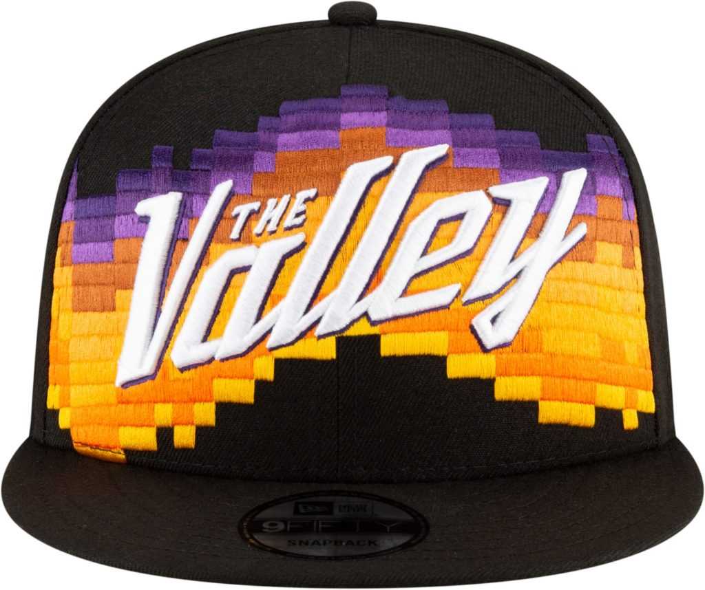
Orange and black will always get my attention when it comes to a good color combo. Shoutout to my elementary school colors. The Suns rarely hang an L when it comes to the gear they put out. Now When Devin Booker is finally in a playoff game this year, the team will be stylin’ and proflin’.
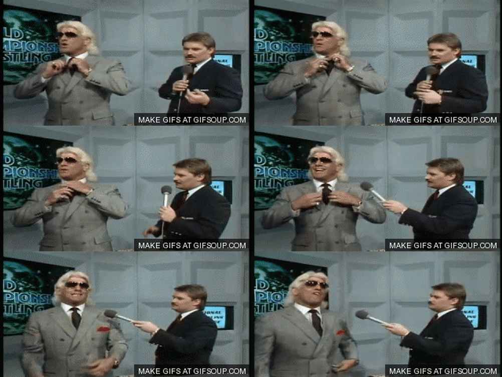
Warriors: B
I like this spin on the Warriors NBA City Edition hat this season. When seeing this hat, I can picture Baron Davis doing the impossible and leading an 8th seed Warriors team in the biggest upset in NBA playoff history. I miss the Warriors being the underdog.
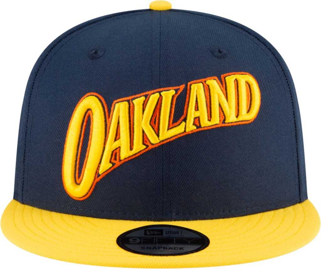
Rockets: A
Another good grade? I’m making myself sick with all this love. The Rockets really got it right with this one. I love the Houston Oilers colors and the H-TOWN lettering. While James Harden seems to be getting in shape to deliver Christmas presents to us all in a few weeks, Rockets fans will hope he leaves this awesome hat before finishing off the milk and cookies.
Kings: No Comment

Last, but most certainly not least, the Kings have really let it all hang out this year. The only NBA City Edition hat I have no grade for. Have no words. If I were a proud Sacramentan, I would really enjoy walking around with the word Sactown on my head. God bless the Kings!
That will do it for my review on this year’s NBA City Edition hats. I went into this hating most of the hats and came out almost feeling the same way. Whatever your opinions may be, please feel free to share them with me, and we can hate the hats together.

