Babe wake up, new WNBA jerseys dropped!

The day is here. Nike and the WNBA have officially revealed their 25th Anniversary collection of uniforms for all twelve teams. Each collection features three designs, all aptly named. Heroine, Explorer, Rebel.
The Heroine Edition is the team’s home white. A uniform color absent in the WNBA since 2015 (welcome back, white jerseys at home)! The Explorer Edition features the team’s primary colors and will operate as “away” jerseys. And lastly, the Rebel edition. The most ambitious designs and the heart of the entire release. These are what players and fans alike have been yearning for. Just ask Diamond DeShields.
“You can’t minimize the impact that the third uniform is going to have on the overall aesthetic of the league,” Chicago Sky guard Diamond DeShields said. “When you make it to the professional level, you want to feel like that experience is elite. Part of that is definitely in the apparel and the uniform. I think it’s really going to be eye-opening and bring more attention to us this season, which is ultimately what we want.”
Katie Barnes, espnW.com
The Rebel Edition WNBA jerseys are meant to capture “female empowerment storytelling” through the lens of the team’s home city. A hyper-specific, more meaningful version of the NBA’s City Edition uniforms.
I won’t dive deep into what these storytelling jerseys will mean to the players and the league they love so dearly. There are more profound writers than myself and I’ll leave that one to the experts. I’m just here to gush over how perfect some of these designs are. What can I say? I love jersey talk! So that’s what I’ll do. Here are my knee-jerk reactions and rankings to the twelve new sets of WNBA jerseys in honor of their 25th season.
Grading Scale
I admit this won’t be perfect. I will be as impartial as possible but there is a level of subjectivity when it comes to jersey design and what people prefer. So here are some general rules I followed when making the rankings so I’m not having to explain myself at every turn.
First and foremost, the bulk of the points will go to the teams with the best full set. The designs have to be something that would look good on the court and/or out in public. Second, if only one of the Heroine/Explorer and Rebel is good its ranking will drop. 2A) Bonus points will be given for the backstory of the Rebel edition design. It’s not air-tight but it’s how my brain operates. So here we go. From least best to best. Let’s get started!
(Disclaimer: I genuinely don’t think any of these are bad and it was very difficult picking a “worst” design. Each one had something great to offer so I do apologize to the last place finisher)
12. Connecticut Sun
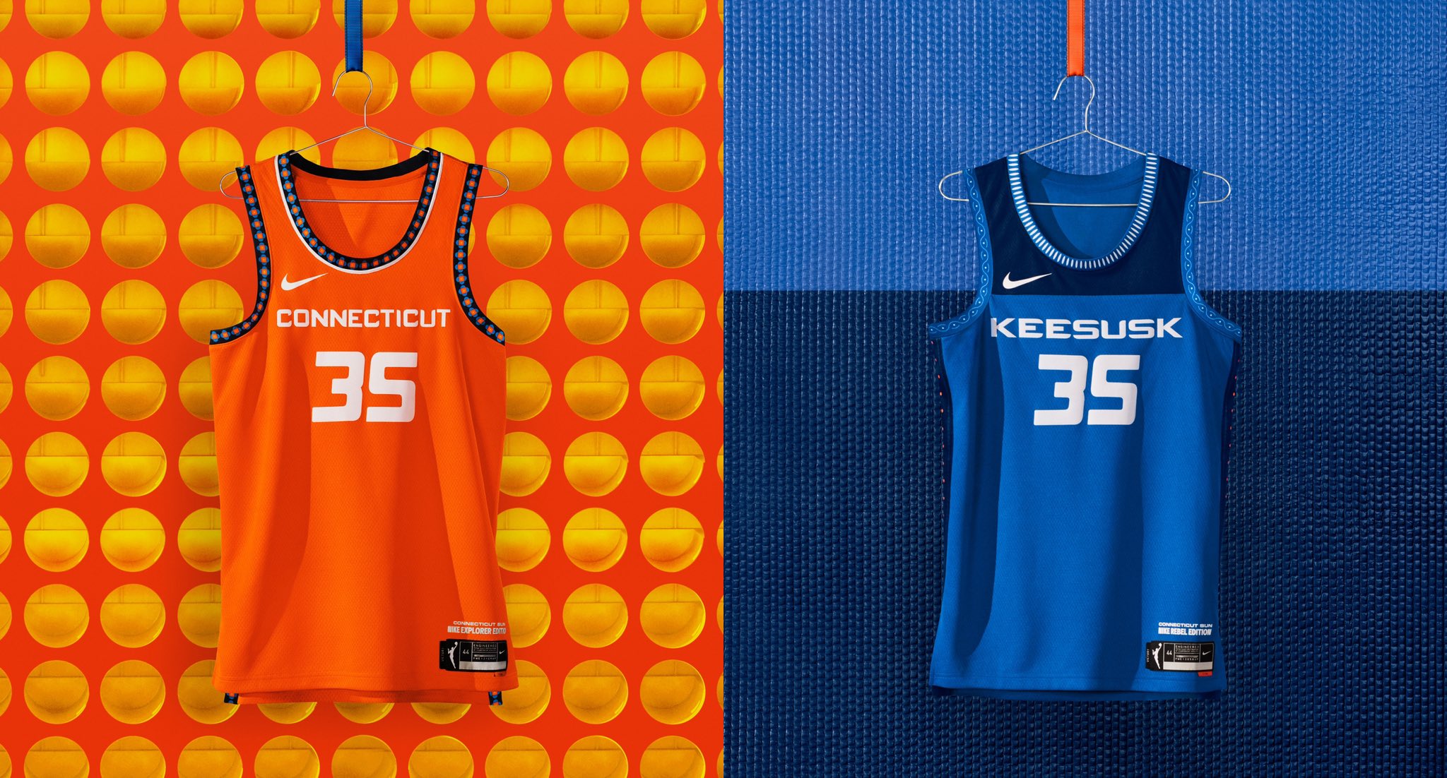
I cannot stress enough how difficult it was to pick a last-place finisher. My bottom three, starting with the Sun, all had similar pros and cons. They each had one supremely awesome design or accompanying story. The Sun’s orange Explorer is so subtly great I can’t even contain myself. But the Rebel design doesn’t get me going as much. The story behind the design and colors are great, but aesthetics come first in the rankings world. Check out the tweet below for more on the Sun’s Explorer jersey.
This is H.E.R. story. Beth Regan of the Mohegan Tribal Council of Elders take us through the tradition and symbolism woven into these threads. pic.twitter.com/YxmsKzE4e2
— Connecticut Sun (@ConnecticutSun) April 8, 2021
11. Dallas Wings

Another incredibly tough decision. I’ll give similar reasoning for the Dallas Wings’s jerseys as I did for the Sun’s. One really awesome jersey, one not as awesome. Their Explorer is good not great (still better than the Mavericks), and the Rebel has a clean look while being accompanied by a really cool inspiration for the look. Unfortunately for Connecticut, bonus points go to the Rebel edition. The low ranking may stem from my thinking that military uniforms don’t always hit in professional sports. But if it’s going to be done, Military Green is a good avenue. The design is based on the P-40 Warhawk. A World War II fighter plane, designed in Texas, tested and flown by Women Airforce Service Pilots (WASP).
Inspired by the P-40 Warhawk, a World War II plane manufactured in Texas and flown by Women Airforce Service Pilots (WASP)…
— Dallas Wings (@DallasWings) April 8, 2021
We bring you our ?ebel story.pic.twitter.com/KKywBBIzPU
10. Washington Mystics

Similarly to Dallas, not the biggest fan of the Explorer, but a huge fan of the Rebel inspiration and design (not so much the look, if that makes sense?). I can’t explain it with the home and away for Washington. It’s just not my favorite. However, we’re celebrating here. The Mystics’ Rebel edition vaults them to the top of my back three. Inspired by major historical events on the route to equality, these have the 19th Amendment scripted throughout the gold line.
Black women played a crucial role in the suffragist movement, yet their full enfranchisement didn’t culminate with the 19th Amendment. It was, however, a start to a new decades long struggle to secure voting rights for all Americans. pic.twitter.com/RnQJyoZjq6
— Washington Mystics (@WashMystics) April 8, 2021
9. Phoenix Mercury
These uniforms – these are proclamations. It’s the people who got us here. The home we represent. The family that won’t let us fall. pic.twitter.com/qMePI0ZVa4
— Phoenix Mercury (@PhoenixMercury) April 8, 2021
It’s entirely possible these could have taken a back seat to the Washington Mystics. But the Phoenix Mercury made me like a gradient professional sports uniform. The first of its kind for WNBA jerseys. And they nailed it. I don’t know how they did it! After seeing what the Atlanta Falcons tried to do with a gradient uniform I was all-out for the rest of my life. The black Rebel edition highlights the “X” in “PHX” as an homage to the great Cheryl Miller, the team’s original coach/GM, who dubbed the home fans as their X-Factor. Also, notice the X up and down the sides of the Rebel jersey.
8. Indiana Fever

Stranger Things has really made its way into official professional sports uniforms, huh? *BIG sigh* Y’know what… no. I’m too positive you can’t bring me down right now. The people love Stranger Things merch so let ’em have it. It plays. Almost literally all the time. It’s lower on my list than would be most others but I’m not ashamed to say TV show branding doesn’t exactly need to be part of these designs (nevermind the fact I have a pair of Stranger Things Nike Blazers). But the show’s protagonist is a badass young-woman with supernatural abilities and people love it. These are going to fly off the shelves. Plus, the Heroine/Explorer editions kind of look like the Nuggets’ uniforms and I enjoy all of it.
a new era of Indiana Fever basketball.
— Indiana Fever
introducing H.E.R. story ?
» https://t.co/0moaUCXeo4 pic.twitter.com/XMYLu6ycGy? (@IndianaFever) April 8, 2021
7. Seattle Storm
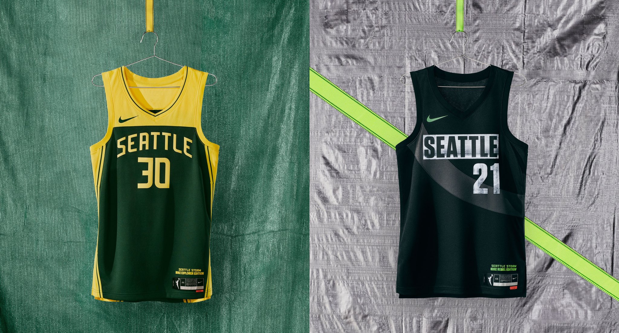
Jordin Canada of the Seattle Storm said it best.
“It gives me a throwback vibe of what the jerseys used to look like in the early 2000s with a modern twist”.
The Storm are repping the green and yellow as well as the Sonics ever have. They’re holding it down for the city, winning championships, and wearing great jerseys while they’re at it. Revamping “classic” uniforms with a modern look generally always goes well. And I love the sash across the upper of the Rebel edition.
We Rep Seattle.#TakeCover pic.twitter.com/5qKTns1hZC
— Seattle Storm (@seattlestorm) April 8, 2021
6. Las Vegas Aces

The Las Vegas Aces already had a great home/away color scheme and uniform design. Being only a few years old they really nailed it out of the gate with their uniforms. That alone instantly vaults them out of the bottom tier. What jumps them up right smack-dab in the middle is their Rebel edition. The crisp, clean, luxury feel of the black with the spades lining the bottom half. It makes me feel like I’m enjoying a $50 mixed drink at the Chandelier Bar in the Cosmopolitan. The M’VP agrees.
Talk to me niceeeee ??
— A’ja Wilson (@_ajawilson22) April 8, 2021pic.twitter.com/kvmnj0UHIq
5. Minnesota Lynx
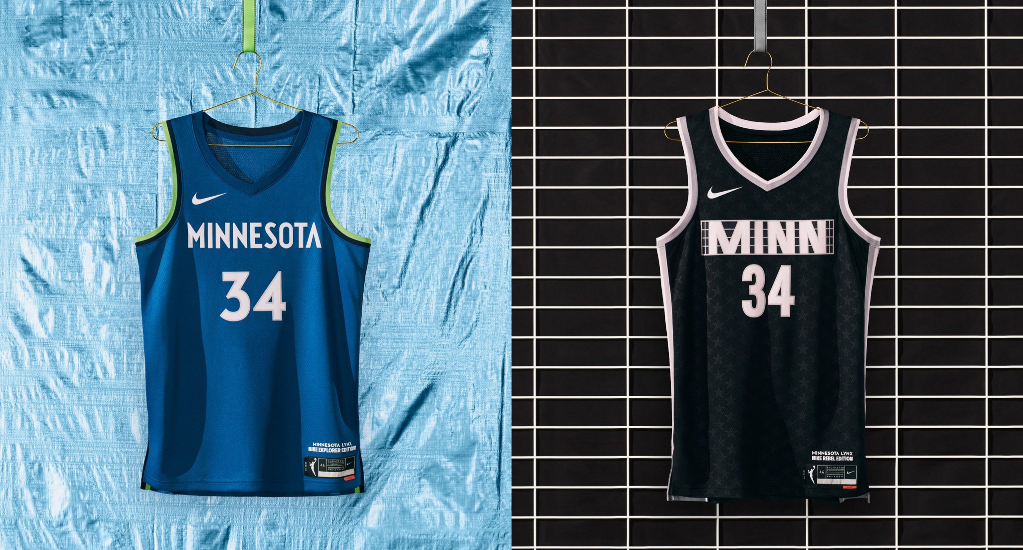
It’s always fun to see WNBA jerseys rival their NBA counterparts. The light blue and green trim really is a good colorway. It just doesn’t feel that way when the Timberwolves are losing all the time. It looks a lot better when you’re winning. So keeping those colors is also a win.
What jumps these to the top half of the list is, of course, the Rebel edition. Inspired by the iconic independent music venue in First Avenue (directly across the street from Target Center), these clean, badass black jerseys are an EASY win. Note the stars in the base layer of the design. It matches the outer walls of First Avenue which feature the names of artists and bands within the stars who have performed at the venue over the years. This gets a bit of a bump from me being that I’m from Minnesota and have had the chance to catch a show or two at First Ave. These are also just objectively cool as hell.
??? ????? ??????? pic.twitter.com/Aj2ZfewLMr
— Minnesota Lynx (@minnesotalynx) April 8, 2021
4. New York Liberty
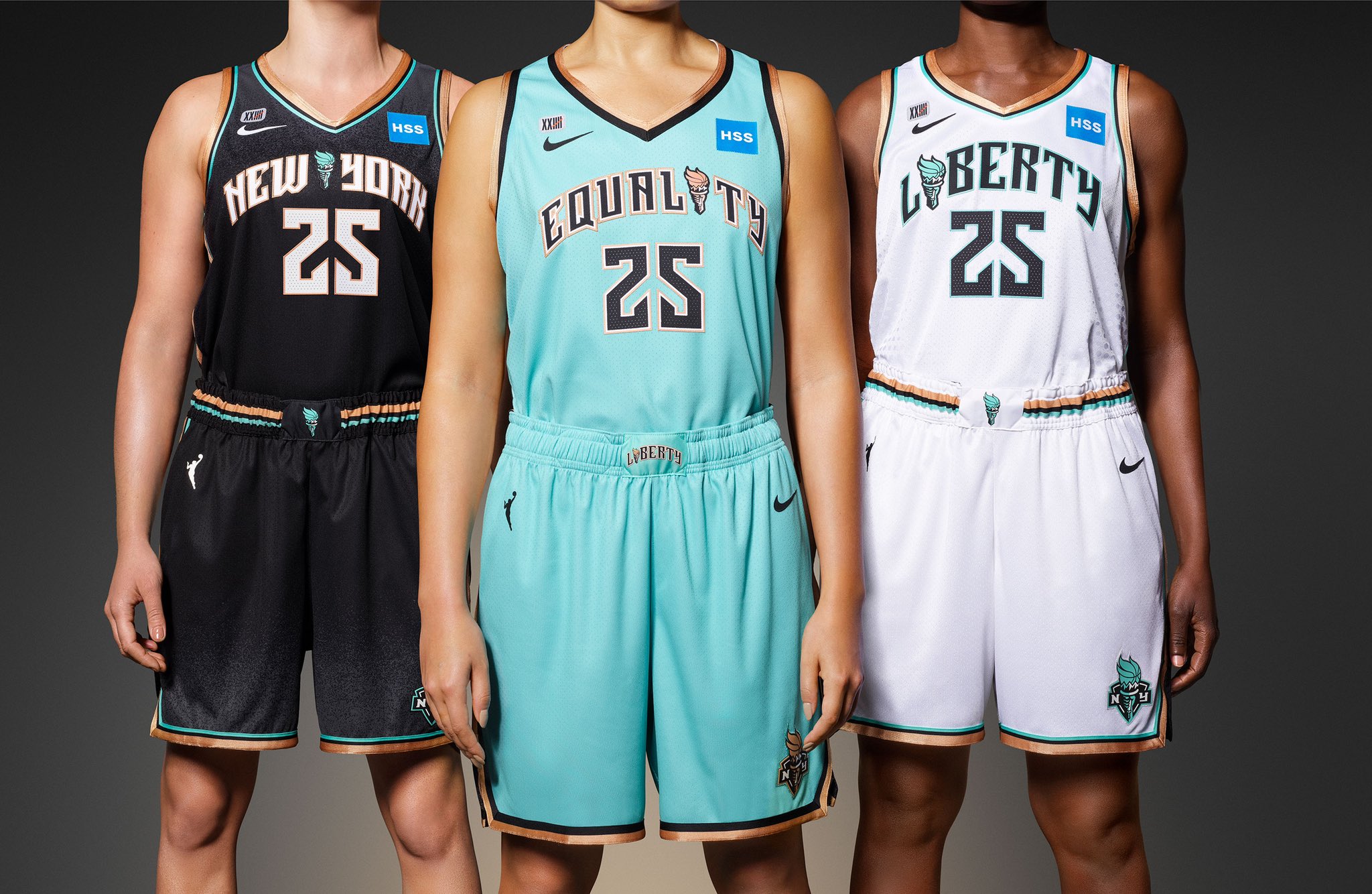
Everything about these hits. The teal color–matching that of the Statue of Liberty for which the team is named–is unique to professional sports teams and it plays very well. The “i” is replaced by the torch, and the torch’s flame is also located on the shorts. A simple and very effective touch. And the Rebel edition replaces the team name or city that would normally be on the chest, with “Equality”. Great placement for your message. “Say it with ya chest!” as the kids say. All three jerseys seamlessly go together in scheme, design, and message. All around good stuff.
A ? behind our seams. #OwntheCrown??
— New York Liberty (@nyliberty) April 8, 2021
(@Nike, @HSpecialSurgery, #NikeWomen) pic.twitter.com/fPmAoip1m8
3. Los Angeles Sparks
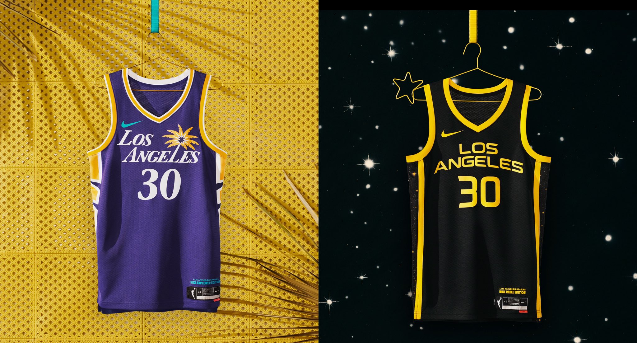
This is where I might catch the most heat. A lot of folks already think these should be #1 but I have conviction in my next two. These are also undoubtedly fire. That purple with the palm tree? Forget about it. It’s so good. According to the Silver Screen and Roll, and agreed with by myself, the new Sparks jerseys perfectly reflect Los Angeles. The black Rebel edition jersey reflects “the city of stars” with the sides being lines with, well, stars. And as much as I love these they’re still ranked third. So I feel I have to explain myself. The purple/yellow + the font for “Los Angeles”, and the black and yellow? The Lakers already did both. And I don’t like the Lakers anyway. So fight me. Just accept that I love these enough to put them top three. They earned it.
??’? ??? ?? ???
— Los Angeles Sparks (@LASparks) April 8, 2021???????
#GoSparks | @nikebasketball pic.twitter.com/a8FHVhtRD4
2. Atlanta Dream
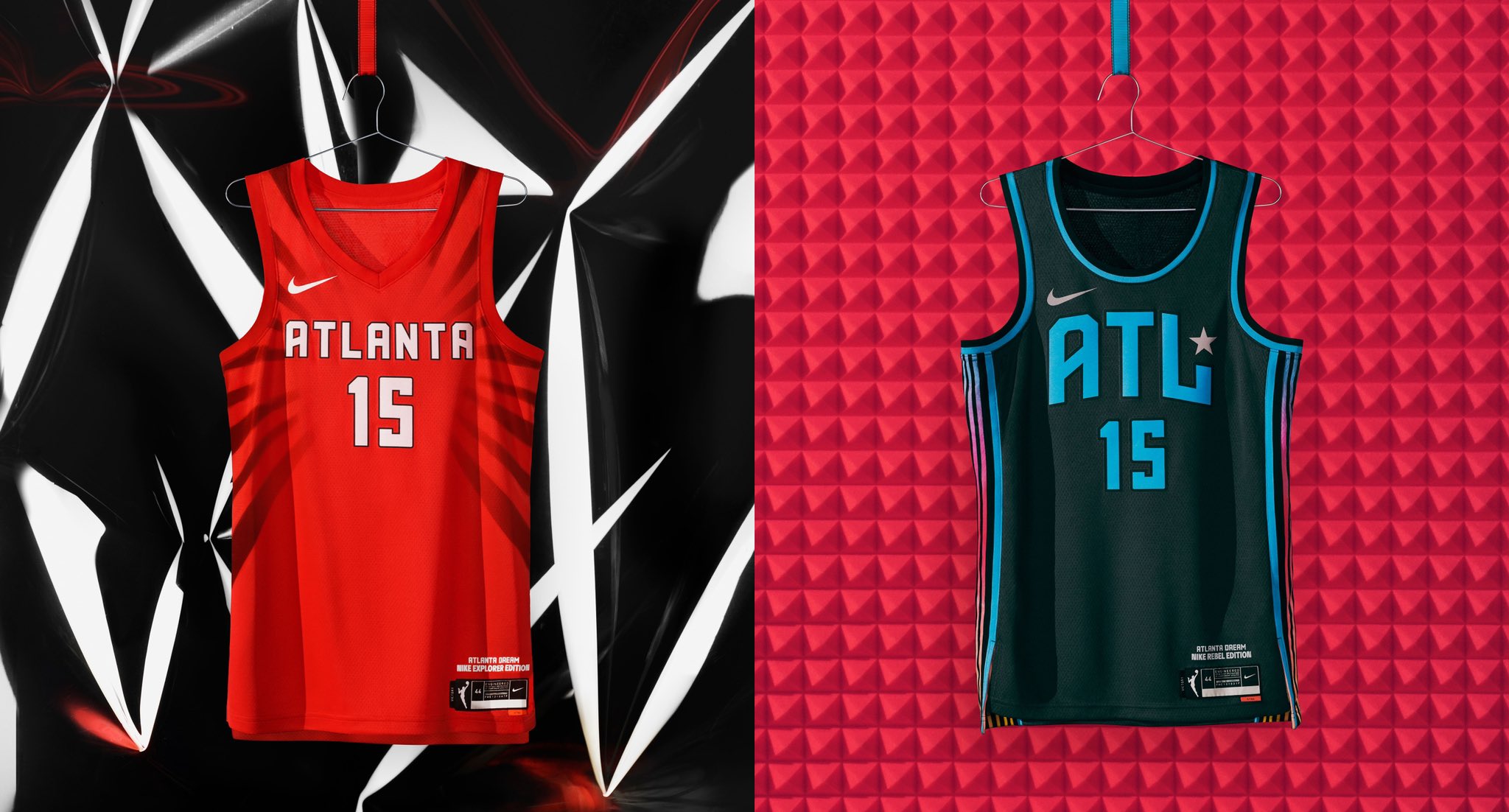
The Atlanta Dream have had a hell of a year. The players openly despised their former owner, Kelly Loeffler, got her to sell the team, and were bought by an investor group that includes a former member of the Dream in Renee Montgomery. Who has become the first former player ever to be an owner/executive of a WNBA team. And now, with the 25th Anniversary season and WNBA jerseys rollout, the Dream easily have one of, if not thee coolest (depending on who you ask), uniform sets in the league. The Heroine/Explorer sets, “inspired by the Civil and Human Rights Movement, feature the vibrant red that Atlanta sports fans know and love”. And the Rebel uniform’s vibrant colors are an homage to 90s hip-hop and Atlanta culture. Civil rights and hip-hop. Beat that. Also, look how badass Courtney Williams is in these.
Unapologetic. Irreverent. Anti-Hero.
— Atlanta Dream (@AtlantaDream) April 8, 2021
Our Rebel uniform pays homage to 90’s hip-hop and Atlanta’s culture through vibrant colors and subtle hints of silver that are symbolic of the platinum and gold records produced by the women of the city. https://t.co/Oj5nkpMwYh pic.twitter.com/1SANUZDQbh
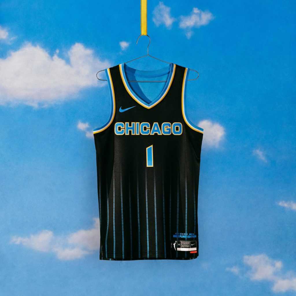
1. Chicago Sky
The pinnacle of WNBA jerseys in the year of our lord and savior (Courtney Vandersloot) 2021. Each individual jersey is a winner. Making the whole set a winner. On its own, the baby blue/yellow combo is a great color scheme. Add a good color scheme to the W and Nike collaborating on the biggest jersey drop in the league’s history? For-get-A-bout-it.
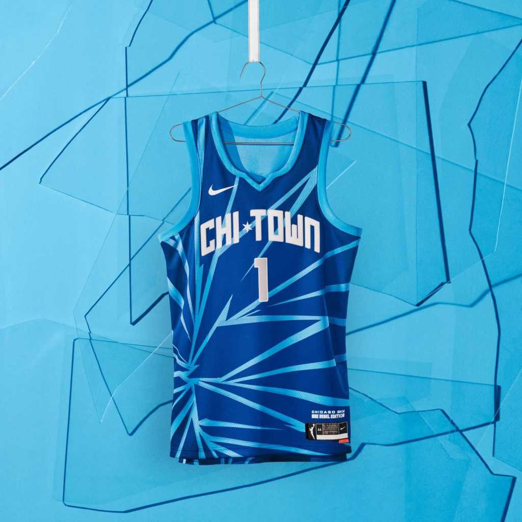
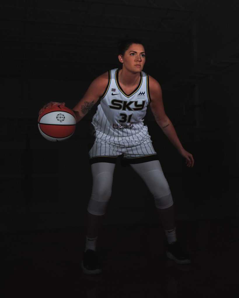
The Heroine home white takes gradient to a sophisticated level by fading pinstripes into a blank white canvas. Similarly, the black Explorer fades from pinstripes to none. But the pinstripes on this one are more vibrant and shiny and make me feel like I’m looking at the lights of the city glistening on a skyscraper on a warm Chicago summer night. Lastly, the shattered glass ceilings Rebel jerseys are what vault them through the top.
The Chicago Sky’s uniform rollout is exactly what the league intended with this project. Update the standard home/away uniforms with a new look to vault into the next era of the WNBA. And go all-out on a third, alternate jersey the league and its players have been clamoring for, while using it to highlight the messages the players want received by their fans and the rest of the world.
Chicago’s new Rebel edition fits the newest member and hometown hero Candace Parker perfectly. Some might even say she inspired the design as one of her most consistent messages is to “shatter glass ceilings”. Candace is going to rep these so hard. Good thing she doesn’t play for the team that came in third on this list.
Follow us!
Be sure to check out Belly Up Hoops for all of our other basketball content as we close out the regular season. If audio is more your speed check out The Midweek Midrange live on YouTube every Wednesday at 9 PM EST. And shoot me a follow on Twitter as well @JMacchitelli23 for article drops and other sports nonsense.


