
Some NHL logos are classic. They have history beyond their years. Other NHL logos are newer, flashier, and contain more secrets than we know. I’ve ranked all the current logos from top to bottom, with the major criteria being aesthetics, history, and creativity. Enough chit chat, let’s get to who looks best on the ice.
1. Chicago Blackhawks
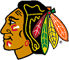
This logo has it all. As part of the Original Six, the Chicago Blackhawks have been donning a version of this logo since their inception. The thing is, when they tweak it, it only gets better every time without compromising any of its qualities. The intricacies of the logo are the only thing more impressive than its history. There has been much debate over how long this logo will last in this day in age, but as the best logo in all of major sports, I hope it’s around for the long haul
2. Detroit Red Wings

Ahh, the winged wheel. The Red Wings have stuck with this logo since the 1948/49 season. Safe to say it has its history. And we thought the Blackhawks had intricacies. Try drawing this bad boy free hand. The Wings’ logo is one of the most recognizable in the world. Some of the best have worn it. If it had more than one color, it may have been number one here, but it’s also the simplicity of the red and white that have it sitting so high on the list.
3. Boston Bruins
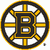
The Big B. This one may be as simple as it gets, but like the two before it, this logo says more than just Bruins. It screams the whole city of Boston. Not to mention, this logo gives the Bruins the coolest looking center ice in the league. As part of the Original Six, like the two before it, Boston has rocked the Big B for a long time. The black and yellow add an intimidating touch that lands this logo in the top three.
4. Minnesota Wild

I know, you were getting sick of the Original Six logos. Here’s a breath of fresh air… and a pretty sick logo. The Wild have used artwork since they joined the league in 2000. Five years ago they removed their name and went with just the logo. Great move. To the naked eye, its a snapshot of a setting (or rising) sun though the trees and clouds. What you may not know, is that the outline of the logo is a side profile of a bear looking off to your left. Don’t see it? Look a little harder.
5. Toronto Maple Leafs
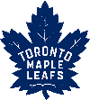
Back to the Original Six. It pains me to include Toronto and Chicago in the Top 5 on any list… ever… but this one is cool. They began with having the leaf veins included in the art. Then they took them out. Now, just two years ago, they added them back in. It looks much better this way. The simplicity of one color, much like Detroit, along with the history of the team are enough to make it a sweet logo. That, mixed with the detailed edges of the leaf and how recognizable it is everywhere, is enough for me to ignore the written text and slide into the top five.
6. Colorado Avalanche
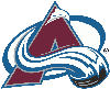
I love this logo. This might be the first on the list that you could possibly argue with me and win, but of the remaining logos, this is my favorite. An “A”, quite naturally, is shaped like a mountain. Add in the fact that the “A” is crossed with the falling snow in an unnatural manner, this uniquely colored logo pleases the eyes. Please, Colorado, never get rid of this color scheme. Please.
7. St. Louis Blues
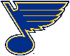
Here’s another classic. Not quite an Original Six team, but they’ve been around for some time. They’ve also always had some version of the note. The city of St. Louis is known for its jazz and blues history, so the music note is pretty fitting. Hockey is a fast paced game, so the feathered wing on the note is a great touch. With the main color being blue, St. Louis didn’t mess up much when creating their logo.
8. Nashville Predators
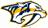
This logo lands in the top 10 for aesthetics alone. This side-angle shot of a saber-tooth tiger is exquisite. It has no texture showing fur, nor colors that would represent the now-extinct saber-tooth. Yet, it still strongly portrays what would be one of the most ruthless killers to walk the earth. You know exactly what it is when you look at it. A true predator.
9. Montreal Canadiens
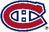
History? Check. Creativity? Ehhh, half check. Aesthetics? Nope. Some might have this one higher on the list, but not me. I get it, the Canadiens are as historic as it gets, and no rafters have a more prevalent logo flying from them. Yes, I know, the H in the middle for the “habitants” of Montreal. But c’mon, the logo looks like a toilet seat. Nevertheless, the one million Stanley Cups to its name and “hidden” H in the logo sneak it into the top 10.
10. San Jose Sharks
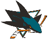
For having a rather generic mascot, the Sharks did well with this logo. It has evolved over time to become one of my more favorites. It looks as if the shark is jumping through the triangle (not to be confused with a dog jumping through a hoop). A broken stick mid-game is a curse in and of itself, so the added humor of the shark breaking the twig is an interesting twist. Another color scheme I’m a huge fan sees this art round out my top 10.
11 – 15

16 – 20

21 – 25


26 – 30
31. Florida Panthers
This one is ridiculous. I want to know everyone who sat in the meeting room when this was decided upon. Are you serious? This looks more like a soccer club logo than anything else? I understand the Jags have the same sort of thing going on in the NFL, but c’mon. Nothing about this logo says anything hockey. Then again, nothing about Florida says anything hockey. They will do good to get rid of this one, ASAP.
***Follow me on twitter, @BellyUpZachMac, for hockey stuff every day. Compete in my #PuckPicks daily for a chance to win free stuff. Literally. It’s free.***


3 Comments
Welp, as a Boston fan, I just so happen to stumble upon this list. I might as well put my own. I wont (typically) put reasons, meaning I still might. The only logo I can’t stand is the caps logo. However, I would much prefer them use their alternate logo as the official logo instead.
MIN Wild
DET Red Wings
CHI Blackhawks [its almost a three way tie between CHI, DET, and MIN for My the best logo list.]
SJS Sharks
NYI Islanders
STL Blues [oh snap! even a bruins fan can’t deny how good the blues logo looks.]
DAL Stars
EDM Oilers [idk why but I like the Oilers logo.]
PHI Flyers
NJD Devils
BOS Bruins [however, I may still have a few biased thoughts here and there…]
NYR Rangers
VGK Knights
NSH Predators
TOR Maple Leafs
MTL Canadians
ARI Coyotes
CBJ Blue Jackets
PIT Penguins
VAN Canucks
CGY Flames
BUF Sabres
LA Kings [I would like to see their logo just change to a crown.]
COL Avalanche [the Colorado Rockies was one of the best in my opinion]
FLA Panthers [Its bad. they probably should have just kept the older logo.]
CAR Hurricanes
OTT Senators
TBL Lightning
WPG Jets
ANA Ducks [I liked the design for the mighty ducks logo. but never-mind that. we got a duck foot instead.]
WSH Capitals [its the only one I can’t stand. I don’t hate it, but I think they should swap it with the alternate.]
You are not too bright. The Panthers logo is the best one. The whalers had the best logo until they up an got out of Dodge. Anyway…..The Red Wings logo has no hockey reference nor does Boston and alot of other teams. Did you go to school to eat your lunch?
Not the best ranking, Florida should not be last. It looks a lot better than some logos like Anaheim or Washington. Also Dallas, Vegas, and NY Islanders should not be so low.