Check out our grades for NBA City Edition Uniforms Part 1 and Part 2 here!
Ever since Nike took over the jersey rights for the NBA, they have guaranteed to be innovative with their designs. They power out multiple new designs each season, sometime totaling up to five per team. Considering the sheer volume of designs, some of these ideas come out fantastic, and others fall flat on their face. The most notable of these annual releases are the NBA City Edition uniforms; special edition jerseys designed to encompass the history and story of both the franchise and their host region. In general, the jerseys have been less interesting as the years have gone on. In addition, some cities obviously have more history to emulate than others, and thus more to work with in terms of design. The NBA has officially released all 30 jersey designs, and it’s time to review.
Cleveland Cavaliers
Grade: D

If you check out my Spotify Wrapped, you’ll see I am all for Pop Punk and Classic Rock. However, these jerseys suck. It looks like someone took the standard Cavs jersey and tried to draw it after an open bar. There is no color change, no real historical significance one can see on the court, I’m not impressed. The Cavs have had some duds for city jerseys in the past; “The Land” in matt grey was not their best work.
Tonight is a night for the Land. The Cavaliers will be debuting their City Edition jerseys! pic.twitter.com/RviXVsg75R
— Cavs Nation (@CavsNationCP) February 3, 2018
Just because you sucked before doesn’t mean you have to suck again! The Cavs are on the cusp of entering a new era, they need to get over the LeBron break up (sorry for my photo choice). I am looking forward to next year, not only to see if the Cavs can successfully round out a roster, but to see if they can successfully design a jersey as well.
Dallas Mavericks
Grade: C

These are pretty fly, but Dallas doomed themselves. Last season’s city uniforms were *chef’s kiss* perfect.
Here is your official look at the @dallasmavs City Edition Jersey. Mavs announce that the jerseys AND court will debut on Nov. 26 against the Clippers. They’ll be available for purchase on that date. pic.twitter.com/ptNKBYZfnR
— Damon R. Marx (@DamonMarxDMN) November 19, 2019
The graffiti jerseys were cool, modern, and brought an entirely different perspective for a team moving from the Dirk era into the Luka era. These are cool to look at, but they don’t offer me the same hype that last year’s did. They are designed from the symbol of Dallas, the legend of Pegasus. I am not from Texas, but I don’t know a single person who thinks of the Mavericks franchise, or Texas in general, and goes, “oh yes, Pegasus.” I think of Dallas and go “oh yes, aggressive youth football and Ted Cruz.”
Houston Rockets
Grade: C+

The Belly Up Hoops team loves these, but I have one problem I can’t get over. I’m not sure when every team in the NBA started referring to themselves as “X-Town.” Sac-Town, H-Town, Chi-Town, I don’t care; they all sound dumb. One thing I do appreciate about this uniform is the historical meaning, my biggest stick when grading uniforms.
Rockets city jerseys are giving me Houston Oilers vibes and I’m digging it pic.twitter.com/vtUngG4dXy
— pi’erre! ➐ (@HoodiePierre) December 1, 2020
These babies are designed to honor the Houston Oilers, or as we now know them, the Tennessee Titans. I love this throwback, but I wish the Rockets did a bit more to really encompass the meaning. There are some teams that go down to the single threads in details; whereas others pick different colors and call it a tribute. Use this opportunity and paint your canvas! As an NFL fan, there was so much more that could have been done here.
Indiana Pacers
Grade: A

I absolutely love these. I know Indiana has been milking the racing theme, but I have a soft spot for non-traditional pinstripes. They found a perfect balance between completely out of left field and something new and interesting, using different but comparable colors and a slightly different design. It doesn’t get to the history I hope for, and is leveraging old themes more than I’d like. But, I would buy this if I lived or cared about Indiana. I have been to Indianapolis once, and I don’t need to go back.
Los Angeles Clippers
Grade: B- (I really want to say C)

Their is so much irony to these official marketing slogans. Yes, the Clippers are in the grind; because their two star players not only hate each other, they hate contributing to a team sport as well! In that vein, why not use the same exact jersey as least year, emulate their same failures twice.
2019/20 ??? ??????? City Edition
— LA Clippers (@LAClippers) November 22, 2019Today: Available exclusively at the @teamlastore
11.27: Available online at https://t.co/UxhLqfpma6 pic.twitter.com/wqXdNFYejh
The reason these are graded highly is because I can’t ignore the fact that I absolutely loved these uniforms last year. The tattoo design is fantastic, and I even bought this as a Christmas gift for someone in 2019. In addition, I have to put my disdain for Kawhi’s attitude and my anger toward Doc’s coaching style behind me, and look solely at this jersey decision. After a remarkably underperformed season, why not pick the same design again right? What the hell, who likes to repeat their same mistakes like this besides the Sixers? Oh wait, the Sixers are coached by Doc now too, haha.
Los Angeles Lakers
Grade: D+

The Lakers have followed a consistent tend since NBA City Editions have been released; each year is dedicated to an LA hoops legend. This year is supposed to commemorate the franchise’s time in Minneapolis; but it rubs me the wrong way. What are these colors? It should be prefaced that I am a Celtics fan, and I have as much disdain for the Lakers as I do for just about any team in sports. However, I know the Lakers’ brand. The Lakers’ brand is so well known that its global. There are other NBA franchises that have not been able to solidify that kind of baseline, granted they aren’t as historic. I will call myself on my own hypocrisy that I love a different color scheme for an NBA City Edition, but these are weird. The Lakers have actually done it quite well in the past. These scream “let me put my daughter to bed”, not “oh shit AD is lurking.”
Mamba Mentality is in the fabric of Los Angeles. Released in 2017 as a part of Nike's "Lore Series," and co-designed by Kobe Bryant, the 'Black Mamba' inspired Lakers City Edition uniform makes it return https://t.co/39B1l3YFDJ pic.twitter.com/Ruwt8QL5aY
— dopekiksyo (@dopekiksyo) August 28, 2020
Miami Heat
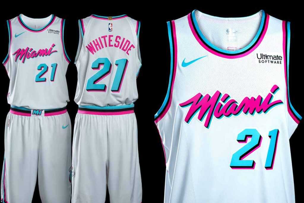
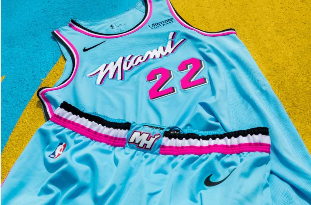
Grade: B+

These have a good, and a bad. Bad news first. Miami refuses to stray away from the Miami Vice theme, and it’s overdone. The good news? This is the best version they have had yet. The tie-dye was a gamble, and I really do not like it on the Nets’ Classic Editions. But, I think this matches perfectly with what they are going for; a future of competitiveness, and a modern group.
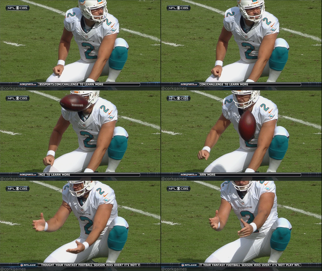
Although this theme is so cool, there is so much history in the city that they can leverage. I think it would be so cool if they took “H-Town’s” approach (I really just hate that they call themselves that). Houston is honoring the history of their football team with the Oilers. The Dolphins are actually one of the most storied teams in the NFL – that jersey would look amazing.
Milwaukee Bucks
Grade: B

I have to follow my own rubric; these are a differing color scheme, they pay homage to the region (although Minnesota seems more fitting for a lake tribute), and they’re relatively pleasing to the eye. In that vein, they’re fine. They are FAR better than cream city (you heard me right).
Be the first to get your hands on the Cream City edition on Wednesday, Nov. 27!!
— Milwaukee Bucks (@Bucks) November 20, 2019
Sign up NOW at https://t.co/j5BaEDonxs.#CreamCity pic.twitter.com/ySEhrNu4H4
Don’t even tell me to get my mind out of the gutter, because that’s exactly where yours went too. Sactown is about to have the same issue. Milwaukee went from a horrible sexual innuendo to the painting of a childhood bedroom wall. I don’t hate it, but I’m bored. The irony here is that they’re trying to get Giannis to stay in Milwaukee. Nothing says “stay with the Bucks Giannis!” like a blue jersey series that is dedicated to Great Lakes and NOT the blues of Greece.
San Antonio Spurs
Grade: A

These are awesome, there isn’t much I need to say really. The Fiesta Edition has been a fan request for years, and management finally complied. The Spurs have made some interesting camo choices in the past, and this is an entirely different approach to their NBA City Edition. That is exactly what I want as an NBA fan; completely different approaches and designs every year. Not only does that drive jersey sales, but it keeps fans interested and excited on how their team is going to present themselves.
Was the 2013 camo jersey the beginning of the end for Kawhi in San Antonio?
— Tom Petrini (@RealTomPetrini) October 29, 2020
In this essay I will https://t.co/ctjsSIWTC9 pic.twitter.com/WrF231E1aE
Toronto Raptors
Grade: D+

I’ll preface by saying this jersey is cool; the bad grade is not because of the look of the jersey itself. But what the hell? The Raptors aren’t even PLAYING in the North this season! You are simply not roaming the North. There was so much opportunity to leverage their interim city in a jersey, OR really capitalize on the fact they won’t be playing near their fans and pay tribute to them. This is a replica of last year’s, and had no effort put into it; just like their offseason roster efforts.
These @Raptors x Tampa jersey mockups are quite something. ??
— Sportsnet (@Sportsnet) December 1, 2020
?: @lucsdesign91 pic.twitter.com/2y30CYgU7x
Say you take this approach; you commemorate the city that is hosting you while you are DISPLACED. This jersey design is so fun and out-of-the-box. Still ties in your roots and logo, but makes light of a sticky situation. This is a huge missed opportunity on the Raptors and Nike.
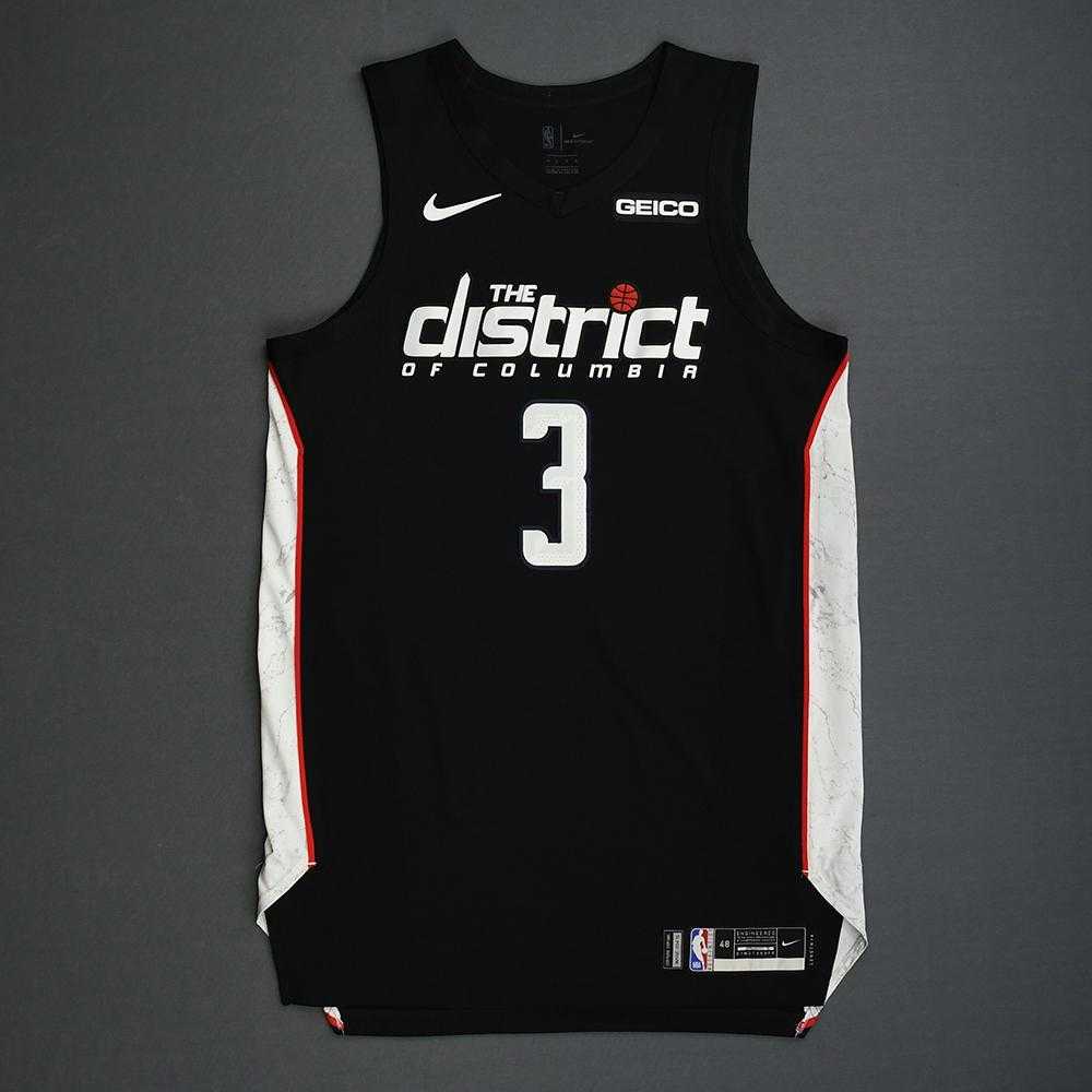
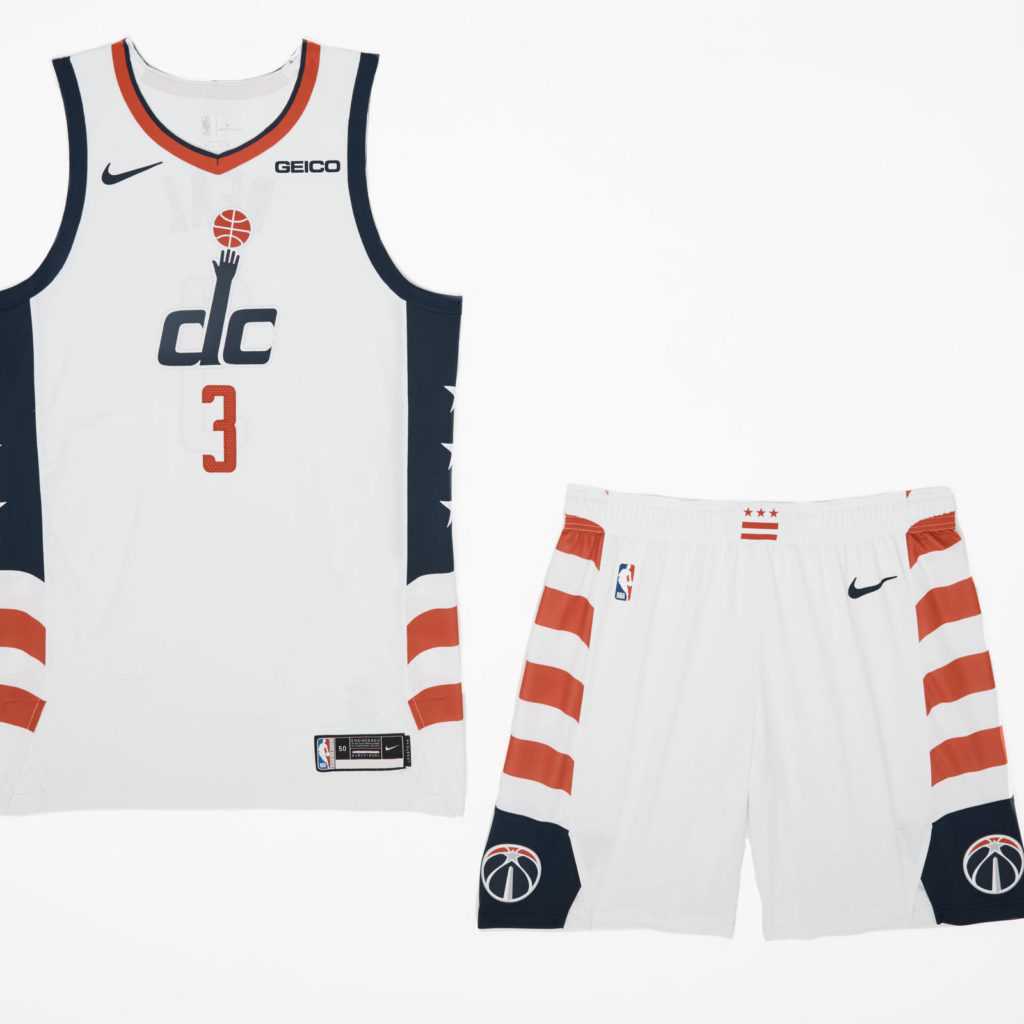
Washington Wizards
Grade: F

Ugh. I live in Washington, DC and I want the Wizards to thrive so so badly. Talk about a city that has history to build a jersey around! Why are the Wizards completely incapable of making an interesting jersey? The Capitals have fantastic retro and throwback uniforms, the Wizards never leverage the history of the city or the history of the franchise in the same way.
Like good lord these are boring. I just had to zoom in to make sure last year’s and this year’s are actually different. The closest thing to a tribute to the city is the American flag on the jersey. Throw me a monument, the Capital rotunda, reference to the recurring marches on Washington, anything. DC right now has an incredibly high homicide rate, so it would be incredible to leverage the Bullets branding as a way to protest the gun violence in the city. Just like the Raptors, hugely missed opportunity yet again.
Disagree and think these jerseys are hot? Let me know on Twitter at @swalshy63 and check out my other great Belly Up Sports content!

 Raging Bull Casino Online Review


/cdn.vox-cdn.com/uploads/chorus_asset/file/9933857/Nike_NBA_City_Edition_Uniform_Washington_Wizards_0105_native_1600.jpeg)
