What is the AHL?
For the less informed, or casual hockey fan, this is the American Hockey League. Basically, the minors. Teams in the NHL have their AHL affiliate which, for all intents and purposes, is their farm system.
We already know that minor league and junior teams can take some creative liberty with their uniforms. With the NHL, it’s all pretty straight forward and sometimes, a little boring. I decided to comb through the AHL and see what they brought to the table. These are just a handful of teams whose logo we should want over their NHL counterpart.
Bakersfield Condors (Edmonton)
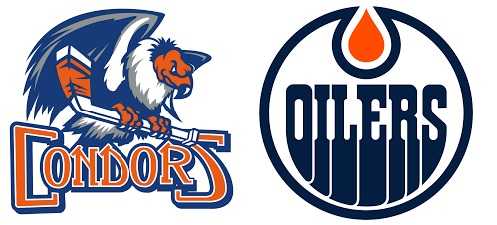
There’s something inherently boring about the Oilers logo. Bakersfield decided to go the intimidation route, and it works. There’s a subtle notion of death included with the Condor, and the Oilers just bore me to death. The colors are all similar, which is fine, but Bakersfield uses them in a much better combination. While the history is there with the oil drop, the Condors just come off the page at you. An all time AHL logo if I do say so myself, definitely an A.
Grand Rapids Griffins (Detroit)
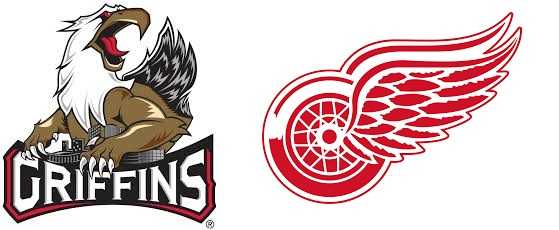
Now now, let me explain. I am in no way discrediting how awesome the Winged Wheel is. I love that logo more than my unborn child. All I’m saying is, Grand Rapids, like Bakersfield, bring a level of tenacity with the Griffin. A hint of the red and white is included in this masterpiece, and it is most certainly a masterpiece. The most eye-catching detail from the jump is the cry of the Griffin, you can almost hear it. As you continue down the artwork, you notice the implied strength of the creature, as well as the incorporation of some of the cities landscape. This one is my only A+ in the field.
Syracuse Crunch (Tampa Bay)
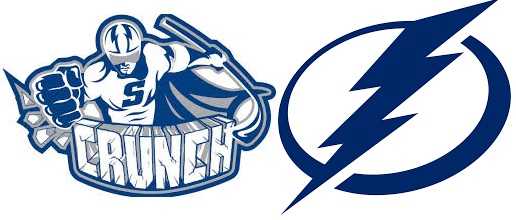
The simplicity of both of these logos is their best quality. Tampa Bay has tried over and over to perfect their lightning bolt, and finally hit the mark with this one. Syracuse, however, outdoes them in a big way. They use the same blue, same simple construct. The thing that separates the Crunch from the bolts, is the literal “knock you out” effect of their logo. I battled with these for a while because there’s nothing not to like about Tampa, and the same can be said for Syracuse. All in all, the Lightning might be a victim of just a little too simple, and the Crunch do JUST enough to win me over between the two, B+.
Hartford Wolf Pack (NY Rangers)
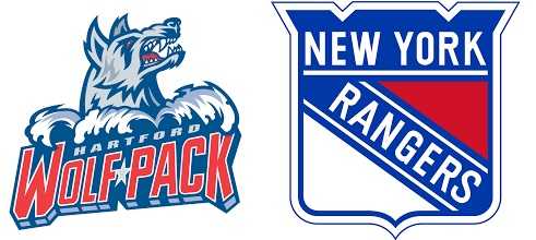
I can keep this brief, because the Rangers shield does nothing for me. It’s boring, pretentious, and Hartford does the red, white, and blue much better. The scowling wolf is enough to make other teams break out their brown pants. The bar is set pretty high in Hartford, and they nailed it. The Rangers have experimented with some pretty extravagant alternate logos in the past, and it might be time to adopt one permanently. Hartford, don’t you change a thing! A-
Binghamton Devils (New Jersey)
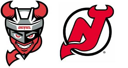
Binghamton does so much more with the EXACT same fixture that you almost wonder if this is an attempt to overtake their NHL brethren. New Jersey could absolutely pull this off, and it would be a welcome addition to the NHL logo field. The shit-eating grin of the Devil speaks to the mischievous persona of the biblical hell raiser. I’ll give both sides credit, the red and black is gorgeous on all fronts. This is another case of letting simplicity get in the way of creative license. I love Binghamton using the Jersey template, and adding a well needed flare. A!
Tucson Roadrunners (Arizona)
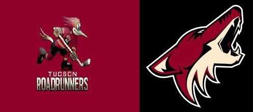
In the spirit of transparency, I don’t particularly like either of these. Not every animal mascot needs added artwork, but this boring, lackadaisical Coyote definitely did. Tucson does more with a cartoon which gives them the freedom to attack it from any direction, yet still took the boring route. It’s cute, whimsical if you will, but both of these need a face lift if you ask me. C+ for the Roadrunners, an A in regards to improving on their big brother.
San Diego Gulls (Anaheim)
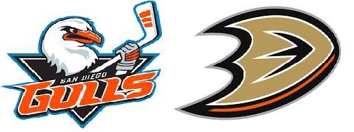
It’s hard to imagine anything less intimidating than a Seagull, except maybe, a duck. If they were still the “Mighty Ducks” this wouldn’t even be a discussion. Alas, we’re stuck with a webbed foot made to look like a “D” and boy is it lame. The Gulls incorporate colors you would expect from a team coming out of SoCal, but the soft blue doesn’t make the stick wielding winged rat any less bad ass. It’s not overly creative, the detail is there but it’s the same basic concept as many a bird mascot but still, this deserves to be praised and has earned a pretty solid B+.
Cleveland Monsters (Columbus)
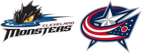
Another easy decision here. The Cleveland Monsters use mystery, lore and legend, and our innate desire to know what’s beneath the surface to draw us into this logo. Columbus, they drew inspiration from the Revolutionary War. Naturally, we’re more interested in what we don’t know, than what has been known for centuries. From the monster just rising above the surface, to the color scheme, even the way they incorporate the team name. It’s almost perfect. I’ll give the Blue Jackets credit, their logo is sharp, and you know exactly what you’re looking at. That’s not to say the unknown isn’t a huge bonus for Cleveland, it’s just so much better than the Columbus logo that the indirect wondering is almost secondary to the rest of the design. I tried to find a reason to give this an A+ but it doesn’t match the Griffins logo. Nonetheless, it’s an A!
Texas Stars (Dallas)
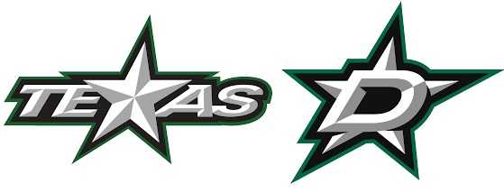
This is simple. The Texas Stars took what Dallas did and showed them what should’ve done. I know, there’s no X in Dallas, but the possibility was there is many ways for them to incorporate the star into the name. Instead, we’re left with a giant D overlapping the star. Texas earns themselves an A- here, not for originality but for seeing the AHL possibility in what was already in front of them.
Wilkes Barre/Scranton Penguins (Penguins)
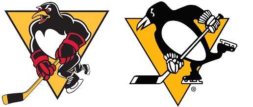
Of all the AHL logos, this one has to be a fan favorite. Away from the NHL version, it seems unique. Next to it’s affiliates less detailed version, it looks bold. There’s absolutely nothing wrong with either of these but god the WB/Scranton Penguin is a good looking bird. He’s tough, and has the body of an arctic circle Adonis. The old school gloves with red detail almost gives a boxing glove look, doubly scary when you see it matches his blood red eyes. If we get the Pittsburgh Penguin on a meal plan, get him in the gym, and a wardrobe change, they don’t make this list. Unfortunately that’s not the case, and we’re stuck with what could’ve been. This logo gets an A, and the award for toughest looking AHL logo.
**Check out my daily #PuckPicks for a chance at free merch @BellyUp_KJ**
Make sure you stay up to date with the Belly Up Sports NHL weekly Power Rankings!

